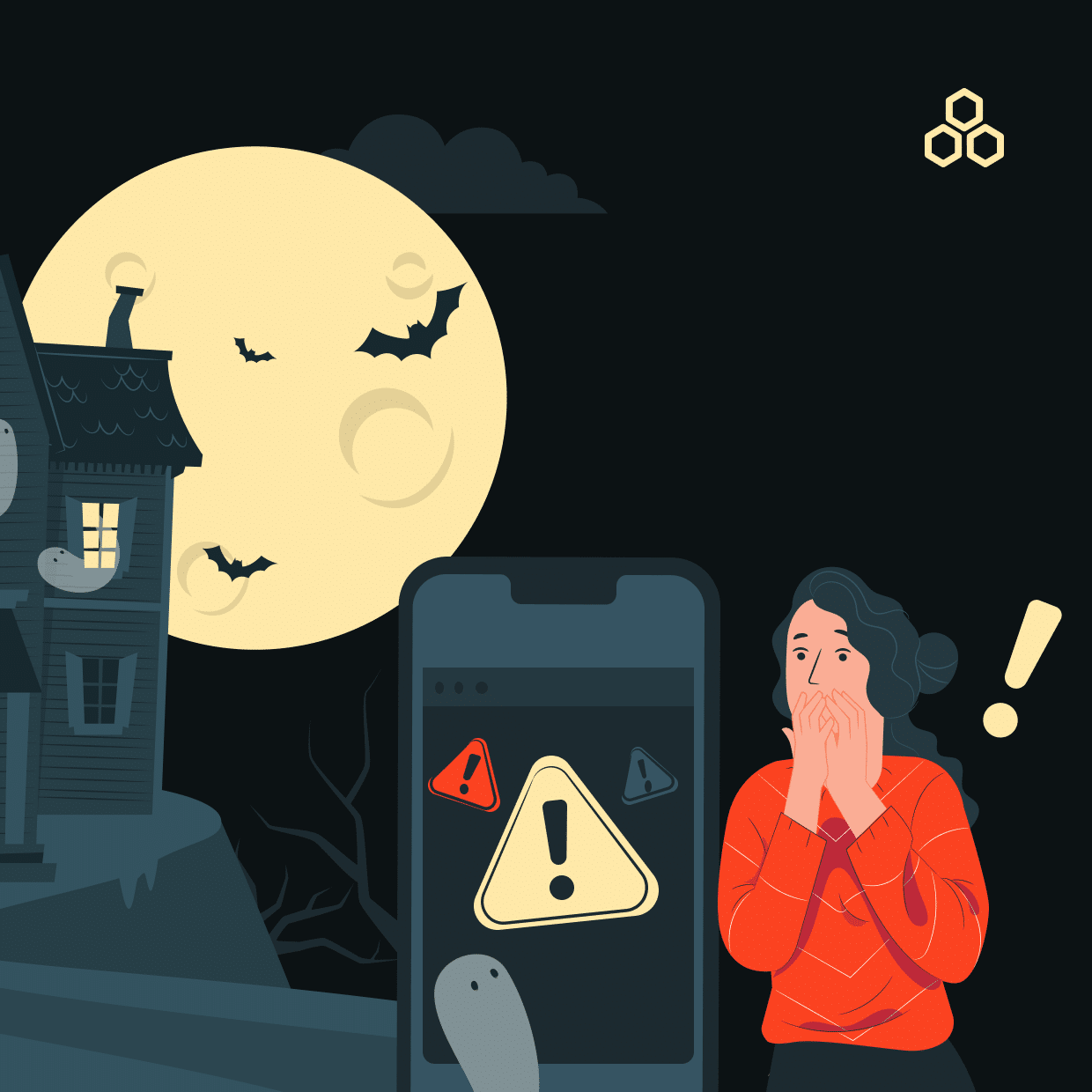

Halloween is upon us, and while we’re all busy preparing our spookiest costumes, there’s another scary topic lurking in the world of design: UX Design Mistakes. These spectral slip-ups haunt websites and apps, scaring users away and leaving a trail of lost customers. But fear not, for we’re here to guide you through the haunted house of UX pitfalls and provide some tricks and treats to ensure your design remains a user-friendly treat!
Mistake #1: The Invisible Navigation Bar Ghost

Imagine entering a haunted house where the corridors keep changing, and there’s no map to guide you. That’s what it feels like when users can’t find their way around a website. Ghost buttons, hidden menus, or unclear navigation can be the stuff of UX nightmares. Avoid this spooky scenario by making your navigation crystal clear. Use conventional symbols and labels, and ensure your menu is accessible from every page.
For example, take a look at Apple’s website. Their navigation bar is as clear as a crisp autumn night, guiding users to different sections with ease. Don’t let your users get lost in the dark.
Mistake #2: The Phantom Loading Time
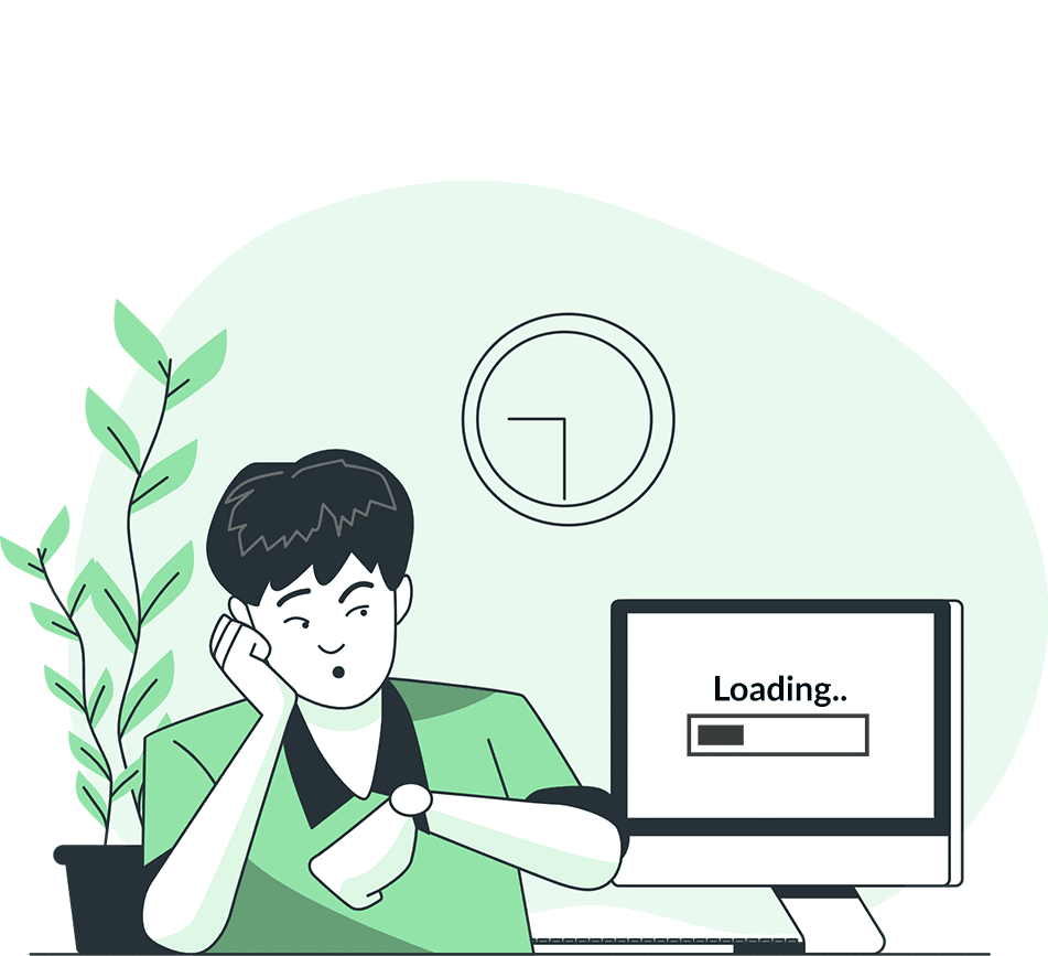
A slow-loading website is the undead of UX design. Waiting for a page to load feels like an eternity, and users are more likely to bail than stay. Ensure your website’s speed by optimizing images, reducing server response times, and utilizing browser caching. Remember, a speedy site is a happy site!
Google is a prime example of speed optimization, as their search results load in a flash. No one likes waiting for a page to rise from the digital grave, so don’t let your site be the slowpoke.
Mistake #3: The Poltergeist of Pop-Ups
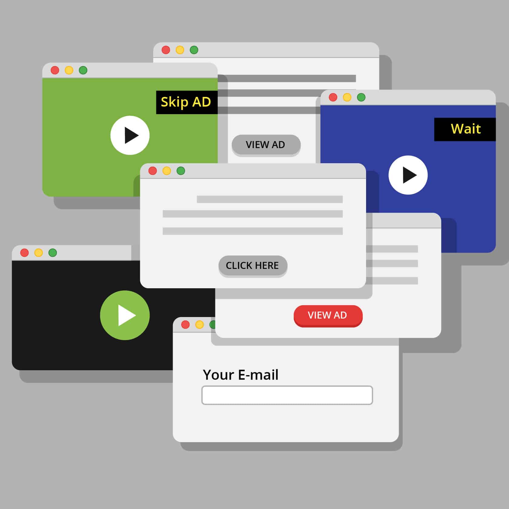
Pop-ups can be the poltergeists of user experience, jumping out of nowhere to disrupt the user’s flow. While they can be useful, overusing them or making them hard to close is a cardinal sin. Use pop-ups wisely, sparingly, and allow users an easy escape route.
HubSpot understands this balance. Their strategically timed pop-ups don’t haunt users but offer helpful resources. Don’t let your pop-ups scare users away; make them a friendly presence.
Mistake #4: The Zombie of Unclear CTAs
Call-to-action buttons should guide users on their journey, not leave them wandering aimlessly. Beware of CTAs that are unclear or buried under layers of content. Make them noticeable, concise, and compelling. You want your users to know exactly what to do next!
Slack’s CTA buttons are crystal clear, guiding users to take action without confusion. Unclear CTAs can turn your website into a haunted maze, so keep them straightforward
Mistake #5: The Haunted House of Form Overload

Forms can turn your website into a haunted mansion if there are too many fields to fill. It’s like asking trick-or-treaters for their life story before handing them candy. Keep forms concise and only ask for essential information. You can always gather more data later if needed.
The Airbnb sign-up form is a prime example of simplicity. They only ask for the essential details, making the process less intimidating. Don’t let your forms scare users away with unnecessary complexity.
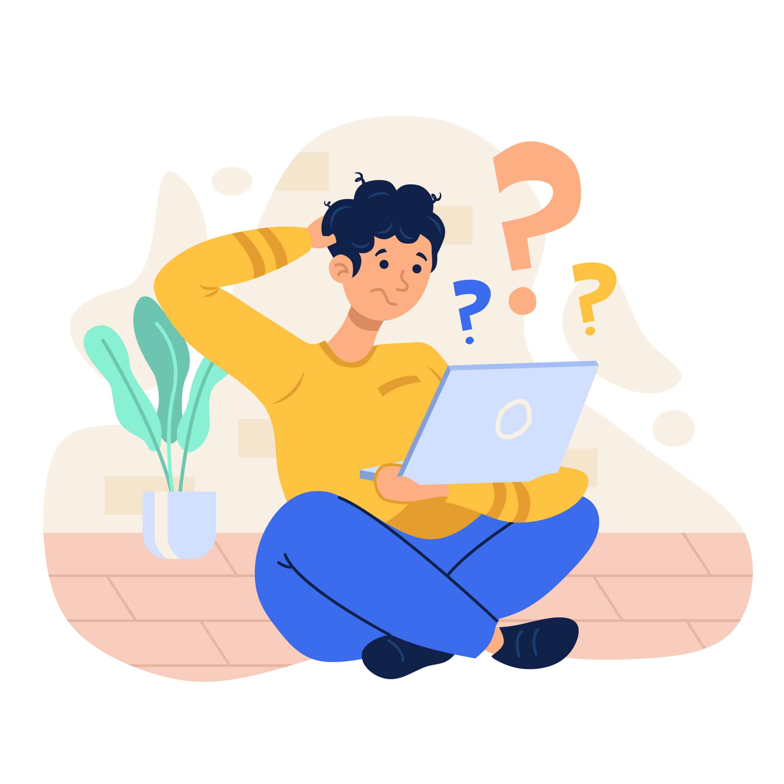
Mistake #6: The Cryptic Error Messages
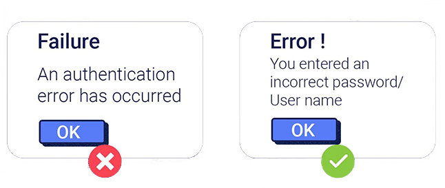
Error messages that sound like ancient spells only a wizard can decipher are UX nightmares. Ensure your error messages are clear, concise, and guide users toward the solution. Nobody wants to wander the labyrinth of cryptic error messages.
For example, GitHub provides error messages that pinpoint the issue and suggest a solution. Keep your users on the right path and banish cryptic errors from your site.
Mistake #7: The Eerie Absence of Mobile Responsiveness
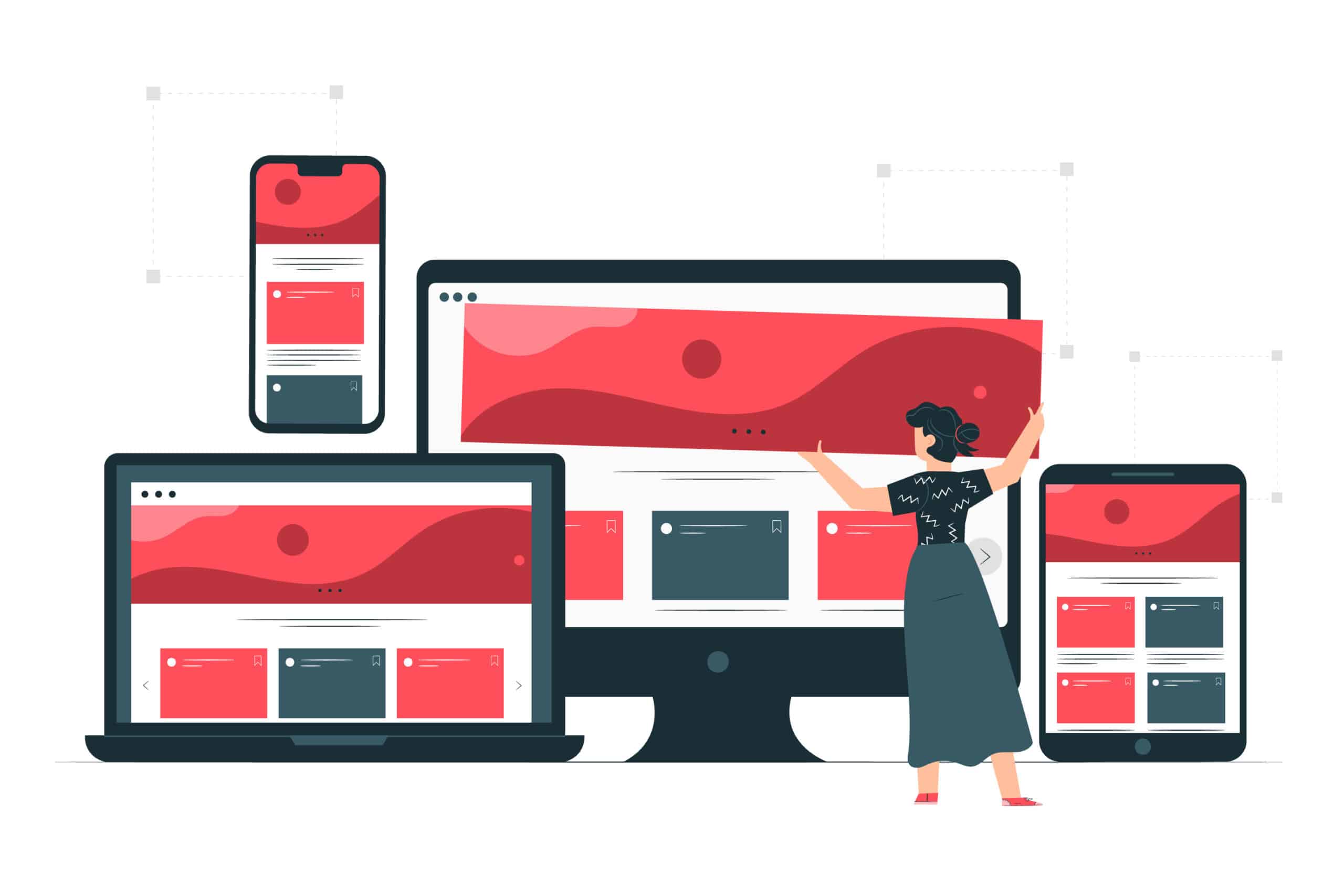
Not having a mobile-responsive design is the equivalent of being a ghost in the digital age. With more users on mobile devices, your website should adapt to various screen sizes. Failing to do so can lead to a ghost town of missed opportunities.
The BBC News website shines on mobile devices, providing a seamless experience. Don’t haunt mobile users with a non-responsive design; ensure your site is accessible on all screens.
Conclusion
Designing a user-friendly experience is about vanquishing these ghosts of UX mistakes. By avoiding common pitfalls, you can create websites and apps that feel like welcoming, well-lit homes, rather than haunted houses. So, this Halloween, remember to treat your users with respect, and you’ll be sure to avoid any tricky UX design specters. Happy Halloween, and may your designs be more treat than trick!
—
What’s Next
Idea Theorem is an award-winning design & development agency based in North America. Through our empathy-driven approach, we have crafted digital products that have positively impacted over 10 million users. Our mission is to shape the digital future by delivering exceptional experiences. Contact Us if you have any questions; we will gladly help you.