
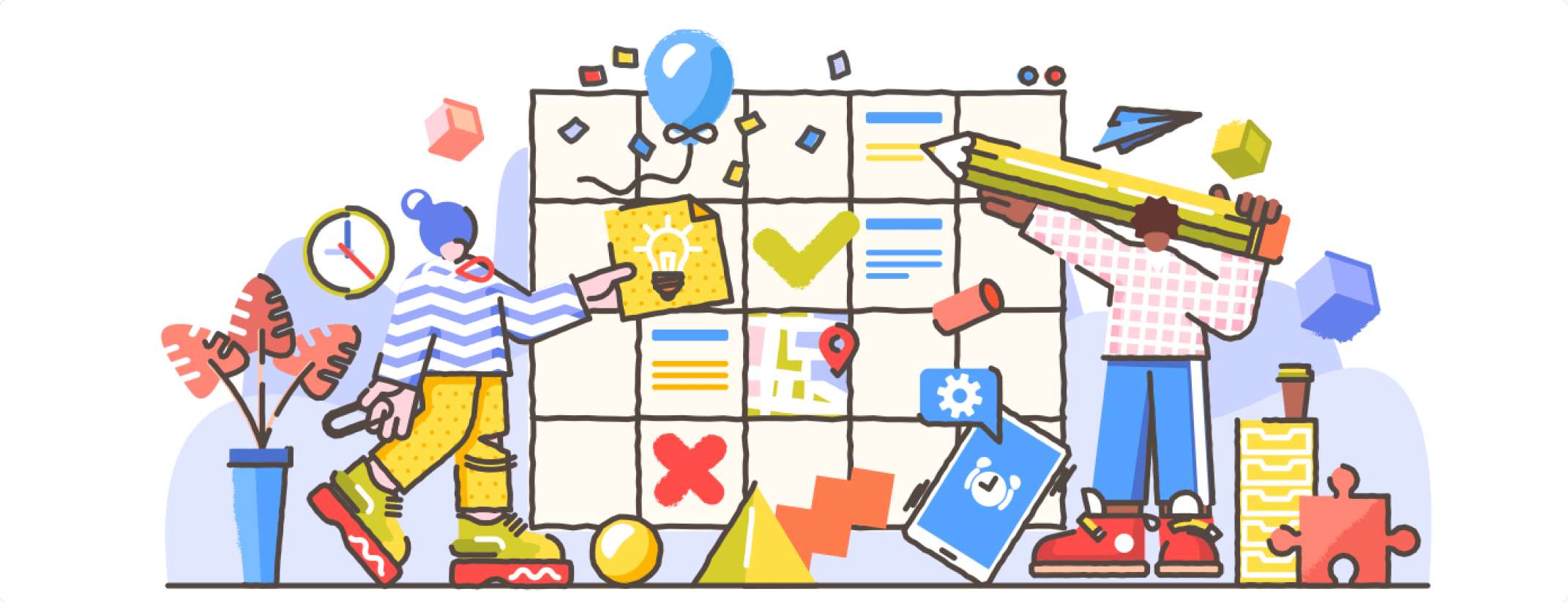
The number of smartphone users is forecast to grow from 2.1 billion in 2016 to around 2.5 billion in 2019, hence having a good mobile app design will help retain users. Users depend on mobile apps to deliver content and services. There are about 5.8 million apps (in both App Store and Google Play store). How to ensure your mobile app is relevant and useful in the ocean of apps? Users experience is an important part of mobile app design.
Creating a good mobile design is not easy. Good apps need to have a clear focus and clarity. If the experience of the mobile app is not great then the user will abandon the app and never come back. The mobile app’s main job is to provide users with “I-wants” moment without any hiccups.
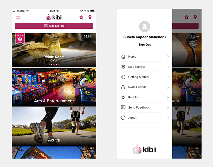
App navigation is very crucial for mobile design. App navigation should be intuitive and friendly. Buttons should be clearly labeled with proper attributes. DO NOT write jargons which users will not be able to understand. Menu categories should not overlap. Allow users to go back easily. Engage users by highlighting key or new features.
Keep in mind:
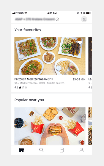
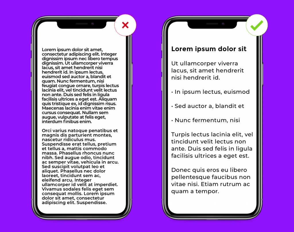
Keep mobile UI design user interface clutter-free. Clarity is an important characteristic of a good mobile design. Too much design elements like buttons, images, text can make any phone app complicated and unable to use. Clutter is one of the worst enemies of UI design. Keep it simple and minimal otherwise, the user will not be able to focus on delivering the message in a clear and concise manner. Already mobile screens have a less real estate (as compared to desktops), so it is best to get rid of unwanted elements. Keep the mobile UI design as inconspicuous as possible and let the user get what they came looking for.
Keep in mind:
Mobile devices have small screens as compared to desktops, fitting in a lot of information in a small mobile UI is a big challenge. Hence, keep the content should be short and easy to skim (users don’t read every word instead they pick out keywords and phrases). The content should be accessible when the user has no data connection. The content needs to be prioritized to enable a seamless user experience.
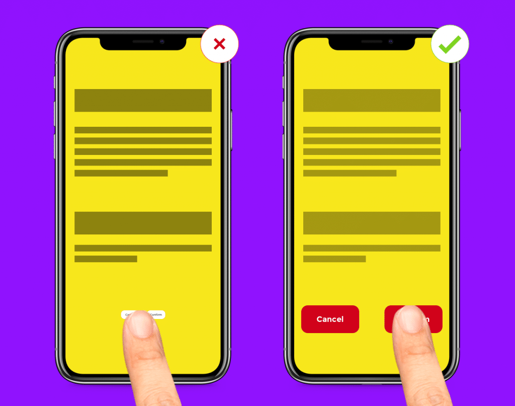
When designing a mobile UI, keep in mind the tap targets. The tap targets should be big enough for the user to tap easily. The smaller the tap targets, the user will have a tendency to tap on the wrong target.
Keep in mind:
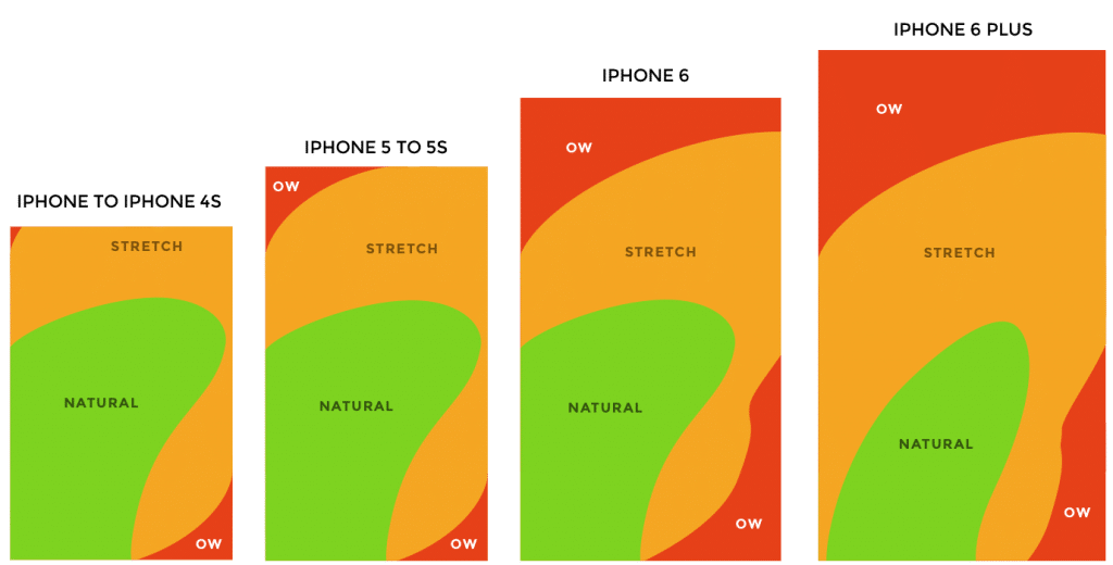
With every new phone release, the screen sizes have increased, holding the device with one hand and browsing the app is becoming difficult. The mobile app design should not only be aesthetically designed but also should focus on the movement of the fingers and thumb (and also keeping in mind which handed side the user is).
Keep in mind all zones when mobile app design is being created. Bigger the phone, more difficult for the user to hold the phone with one hand and tapping on targets if they are in the “OW” zone.
Follow the design conventions set by Android/iOS. Each has a different way of navigation, content layout, buttons etc. If you have Android design guidelines for iOS (or vice versa), you are risking a seamless user experience of the app. Try to keep everything as native as possible. Mobile UI kits are different for each OS. Understand each OS guidelines and then start working on mobile app design.
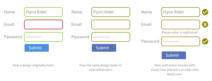
With governments taking measures to make products accessible for everyone, designers need to have empathy and create a different experience for different people through the same mobile design. A well-designed product should be accessible to different users such as users with low vision, any type of blindness, motor and hearing impairments. With inclusive design, people with disabilities can perceive, navigate and interact with your product.
Keep in mind:
To read more about accessibility design, go here.


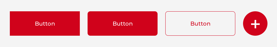
Use familiar mobile UI designs for the buttons. Do not make any fancy shape or element and say that this is a button. For mobile app design, do not use text links as a button. Few common button design types are:
Keep in mind:
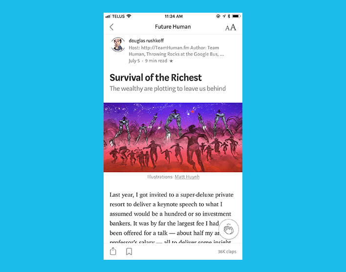
As the real estate for the mobile screen is very less, it is quite difficult to make the right typographical decisions. Mobile typography needs a huge attention to detail with the use of the right fonts, white space, and alignment. The key things to keep in mind while designing a mobile UI is that the content should be legible and readable.
Keep in mind:
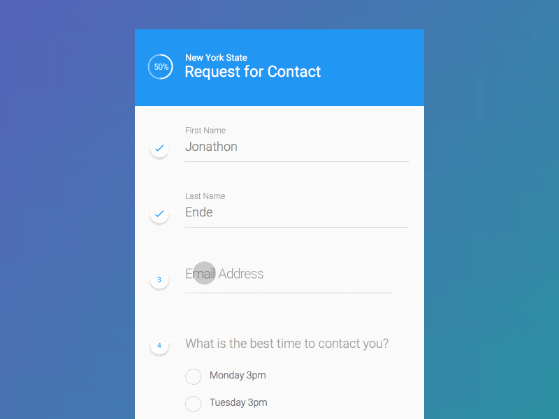
Users don’t like to be bombarded with huge forms, especially in the mobile phone where they like things to be done quickly.
Keep in mind:
The first impression is the only impression users will remember. If the user does not like what they see for the first time, the mobile app will not get a second chance. Onboarding should not be boring or repetitive or long. In today’s world, nobody has time, especially with a mobile app. The app should be fast and the user should quickly understand the purpose.
At the end of the day, there should be a seamless user experience without the user scratching his head to understand how the product works. Before starting mobile app design know your target audience by creating lean personas, customer journey map and user research. So that you know who you are designing the product for. The better you know your audience, the right experience can be created for them.

—
Idea Theorem is Toronto based UI UX Agency. We create simple and usable products for web and mobile. Our human-centered design approach lets us understand your customers, identify their pain points & deliver solutions that enhance their experience with your brand. Contact Us if you have any questions and we will be happy to help you.