We started by reviewing the existing IA and creating a detailed sitemap and content inventory to understand the website’s structure. This helped us identify scattered and redundant information, which led to the merging of overlapping personas.
After identifying six core personas (Teens, Seniors, Adults, Indigenous, Recent Immigrants, Disabled), we conducted focus groups to gain insights into their specific needs and pain points. This step allowed us to tailor the IA to the unique user journeys of each persona.
We mapped out the user journeys for each persona, revealing common paths across groups. This helped us design a hybrid IA that would work for both persona-driven and journey-based structures, making it easier for users to find the information they needed based on their needs.
In the final phase, we applied the insights gained from user research to restructure the IA, resulting in improved navigation, clearer content categorization, and a simplified layout that aligned with the users' needs.
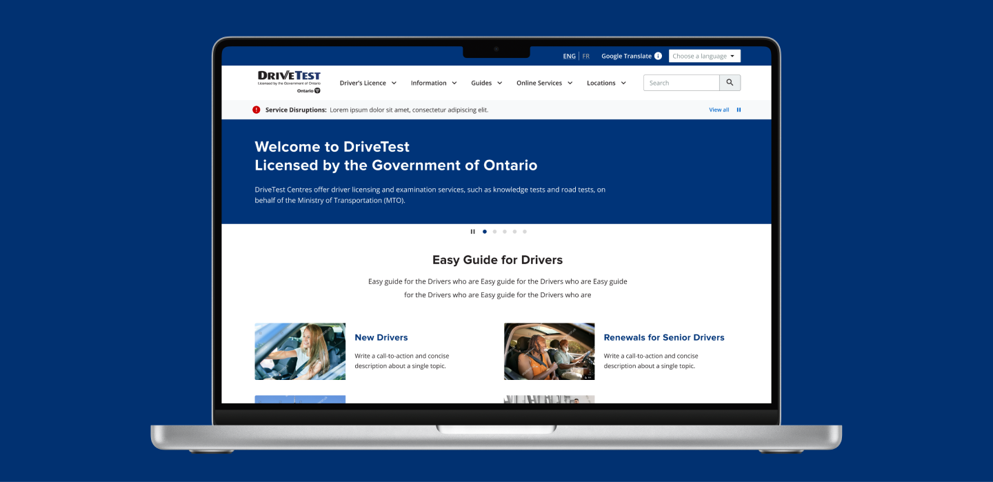
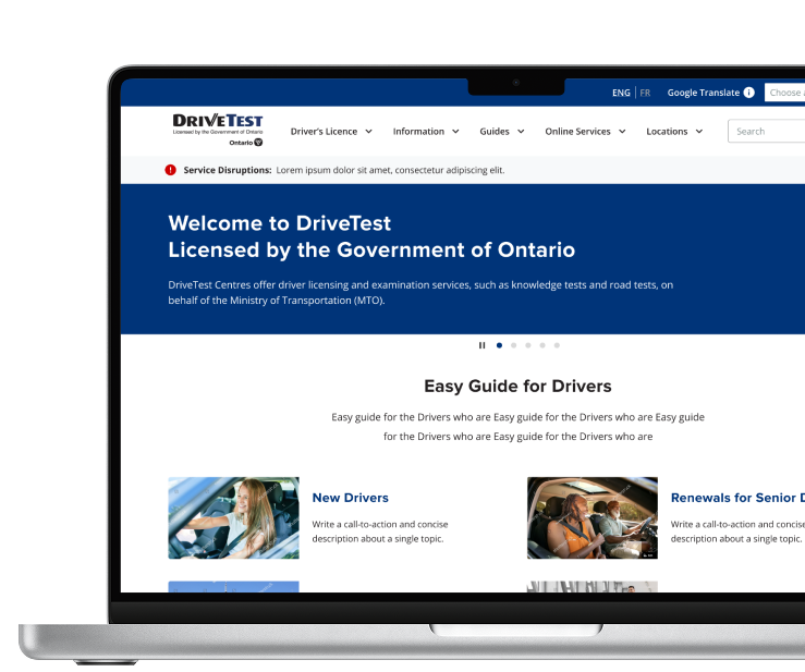
The restructured IA used clear categories, making it easier for users to find relevant information. The cascading navigation system grouped pages under intuitive categories, streamlining access to content.
We created dedicated persona pages, which offered specific, relevant information for users based on their unique needs. This resulted in a 20% decrease in website searches, as users found the information they needed more quickly.
The restructuring of content led to shorter, more focused pages, with relevant information consolidated into single sections. This improved the readability and accessibility of key information.
By addressing pain points identified through focus groups and aligning the website’s structure with user journeys, we significantly improved the website’s usability, making it more intuitive and easier for users to navigate.