The Challenge
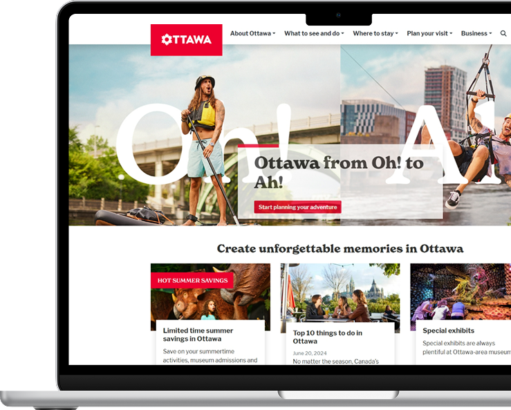
The Ottawa Tourism website, a key resource for potential visitors, faced challenges in providing an intuitive user experience across multiple devices and user groups. Issues such as a confusing information architecture, unclear navigation, and difficulty finding crucial content led to frustration and a disjointed user journey. With diverse user personas like Active Adventurers, Sophisticated Explorers, Family Frugal, and Business Travelers, the site needed to be optimized to meet the varied needs and expectations of these personas.
Idea Theorem’s goal was to conduct user testing on both mobile and desktop platforms to identify pain points, flow challenges, navigation issues, and gather feedback on the overall aesthetic and visual design. Based on these insights, we offered recommendations to improve usability, streamline navigation, and organize content for a more seamless user experience, ultimately boosting engagement and retention.
Our Approach
User Testing Across Devices
We started by reviewing the existing IA and creating a detailed sitemap and content inventory to understand the website’s structure. This helped us identify scattered and redundant information, which led to the merging of overlapping personas.
Tree Testing & Card Sorting
After identifying six core personas (Teens, Seniors, Adults, Indigenous, Recent Immigrants, Disabled), we conducted focus groups to gain insights into their specific needs and pain points. This step allowed us to tailor the IA to the unique user journeys of each persona.
Website Audit
We mapped out the user journeys for each persona, revealing common paths across groups. This helped us design a hybrid IA that would work for both persona-driven and journey-based structures, making it easier for users to find the information they needed based on their needs.
Report & Recommendations
In the final phase, we applied the insights gained from user research to restructure the IA, resulting in improved navigation, clearer content categorization, and a simplified layout that aligned with the users’ needs.


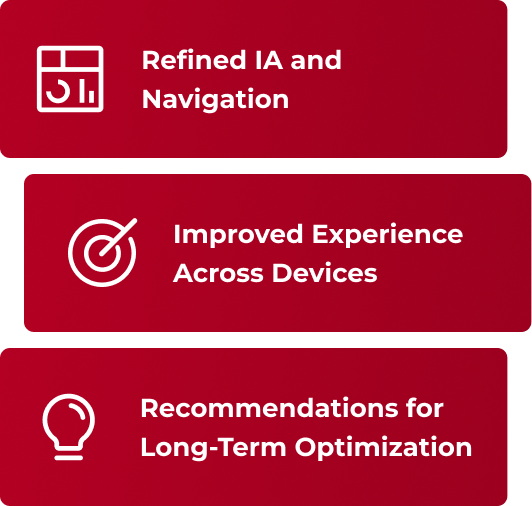
The Outcome
Clearer Information Architecture
With insights from tree testing and card sorting, we restructured the website’s content to create clearer, more intuitive navigation. This improved the way users navigated through content and found relevant information, reducing confusion and enhancing user satisfaction.
Improved Navigation and Flow
The refined UI/UX design and streamlined navigation resulted in a more intuitive and engaging user experience, making it easier for different user roles to interact with the platform efficiently.
Improved Discoverability
Through improved IA and enhanced content organization, we enhanced the discoverability of key attractions, events, and tourism resources on the website. This made it easier for users to explore and find relevant information, enhancing their overall satisfaction
More Leads for B2B
Our efforts also focused on optimizing sections catering to B2B audiences. By improving visibility of B2B resources and information, we facilitated more effective lead generation and conversion opportunities.