The Challenge
Idea Theorem worked on two redesign projects for George Brown College.
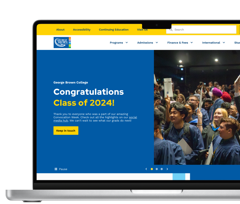
GBC Homepage + Workshop
The college’s existing homepage lacked a strong sense of community and did not effectively engage prospective students. The client needed a redesign that would increase visitor traffic, reduce reliance on contact centre support, and better showcase key content such as new programs, social media updates, events, and important dates. Additionally, the homepage needed clearer call-to-action (CTA) prioritization to guide users toward key actions, such as exploring programs, registering for events, and applying. The goal was to create a more engaging, informative, and user-friendly experience that fosters a sense of belonging while improving accessibility to essential information.
Program Finder
Additionally, to further enhance the student journey, we improved key webpages that help prospective students explore and compare programs before applying. This included redesigning the program finder, program details, program comparison, financial aid, and other related pages to ensure a more intuitive and seamless experience.
In addition to optimizing content and usability, the goal was to prioritize the information students are actively searching for while integrating a refreshed visual design that aligns with the new homepage, maintaining a cohesive and engaging user experience across the site..
Our Approach
For the college homepage redesign, we took a research-driven approach to enhance usability, engagement, and conversion rates. We began with a usability audit and competitive analysis, evaluating key elements such as the main slider, navigation, and content hierarchy. This informed a design workshop, where we explored aesthetic directions and content prioritization strategies. To ensure our solutions met user needs, we conducted usability testing with students, validating design decisions in real-world scenarios. Additionally, a content audit and information architecture review helped streamline navigation and optimize user flow for both new and returning students. These insights led to actionable recommendations, aligning the homepage with best practices while improving clarity, accessibility, and engagement.
Usability Audit & Competitive Analysis
Evaluated the main slider, navigation, and content structure, analyzing competitor websites to identify best practices.
Design Workshop & Ideation
Evaluated the main slider, navigation, and content structure, analyzing competitor websites to identify best practices.
Student Usability Testing
Conducted real-world testing with students to validate design decisions and improve user experience.


To further enhance the student journey, we redesigned key pages including program finder, program details, program comparison, financial aid, and other related pages to create a more intuitive and seamless experience.
Sprint-Based Wireframing & Iteration
Took a sprint approach, designing one page at a time and refining multiple layouts.
UI Implementation & Expansion
Applied and expanded the homepage UI elements to maintain design consistency.
Design System Enhancements
Developed additional components and templates to scale the design system.


Our redesign established a modern, engaging, and accessible homepage that better represents the college’s identity while improving user navigation and interactions.
Established a New Visual Identity
Set a bold precedent for the college’s look and feel.
Enhanced User Experience
Streamlined navigation and optimized content prioritization.
Increased Engagement
Compelling visuals and intuitive design entice prospective students.
Improved Usability
Simplified information architecture for seamless browsing.
Stronger Brand Presence
A modern, front-facing page that reflects the institution’s values.
Higher Conversions
Encourages exploration and drives prospective student inquiries.
The improved program finder pages offer an intuitive, personalized, and visually cohesive experience, helping students easily explore and compare programs based on their unique needs and interests.
User-Centred Design
We created an intuitive and easy-to-navigate program finder that takes into account the diverse needs of students (e.g., domestic, non-domestic, and international), allowing them to filter and explore programs based on criteria that matter most to them, such as interests, career goals, and qualifications.
Simplified Decision-Making
By providing clear, organized program categories and pathways, we helped students quickly understand their options and make informed decisions about which program aligns best with their aspirations, reducing decision fatigue and improving their overall experience.
Enhanced Discovery
Leveraging data and insights from the student journey map, we designed the program finder to surface personalized recommendations and relevant program details, ensuring students can easily find and compare programs tailored to their individual needs, interests, and qualifications.
Improved Engagement and Retention
The design focused on reducing friction points, offering easy-to-digest information and clear call-to-actions (CTAs), encouraging students to take the next steps toward applying, ultimately leading to higher engagement and better program selection.
Streamlined User Experience
By aligning the program finder pages with the overall website design and ensuring consistency with the new homepage look and feel, we created a seamless user journey that allowed prospective students to move effortlessly from program discovery to application, enhancing the overall experience and increasing conversion rates.