In UX, dark UX patterns are deceptive UX/UI methods designed to trick, manipulate, or mislead users into taking actions they may not want to perform. A common example is hiding additional fees by making them visually difficult to notice during the checkout process. These dark UX patterns exploit human psychology to drive company goals, increase conversions, or maximize profits at the expense of the user.
It is important to recognize that dark patterns are not an ethical or user-centered design practice.
Despite growing awareness around ethical design, some companies still implement dark UX patterns within their digital products. The primary reason is often short-term financial gain. Rather than focusing on long-term user satisfaction and quality user experience design, organizations may prioritize immediate business metrics such as subscriptions, purchases, or sign-ups.
In some cases, dark patterns can appear effective because they influence user behavior and generate short-term results. However, this success often comes at the cost of user trust and brand reputation.
Great user experience design is built around creating intuitive, enjoyable, and transparent interactions. It prioritizes the needs of users and ensures they can navigate products confidently without feeling manipulated.
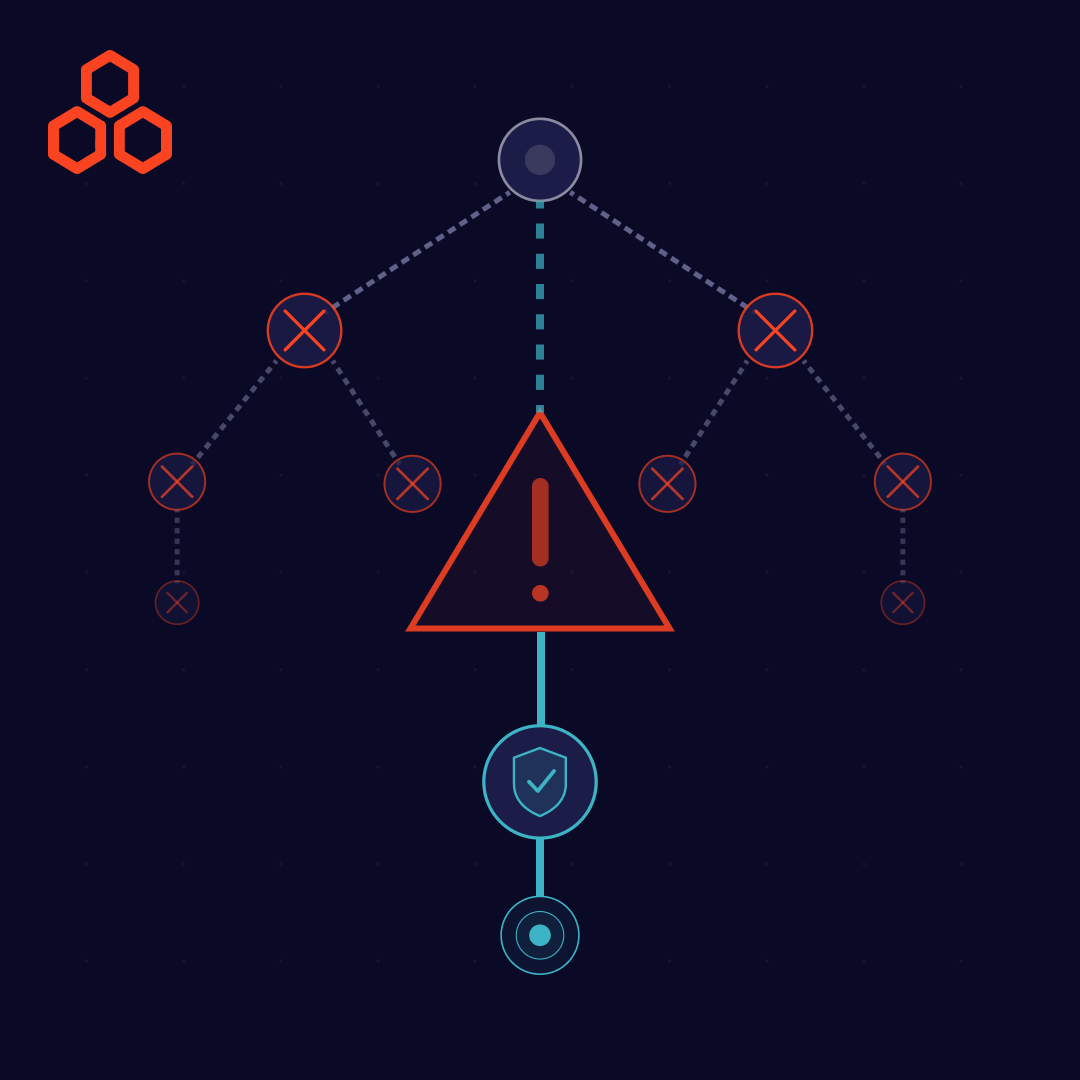
Dark UX patterns undermine trust by taking advantage of users through deceptive tactics. This directly conflicts with the principles of ethical UX/UI design, which emphasize honesty, accessibility, and user empowerment.
Additionally, dark patterns can harm a company in the long run. Modern users are increasingly aware of manipulative design practices and are less willing to tolerate them. When users feel deceived, they may experience frustration, dissatisfaction, and a loss of confidence in the brand.
Over time, this damages customer loyalty, weakens user relationships, and negatively impacts the overall product experience. Effective user experience design focuses on building trust, not exploiting it.
Instead of relying on dark patterns, organizations should implement proven UX best practices that create value for both users and businesses from the beginning.
Idea Theorem™ created a checklist of 13 dark UX patterns to help product teams identify and avoid deceptive design practices.
Are you using language that attempts to shame users for choosing to opt out of an offer, subscription, or service?
Are you presenting confusing or misleading questions that encourage users to select options they may not fully understand?
When a user’s free trial expires, are they automatically charged without receiving a clear warning or reminder?
Are advertisements designed to look like native product content, making them difficult for users to identify?
Are additional fees, taxes, or delivery charges hidden until the final stage of the checkout process?
Are extra products, services, or add-ons automatically included in the user’s cart without explicit consent?
Are you making it unnecessarily difficult for users to cancel subscriptions, delete accounts, or opt out of services?
Are visual elements being used to steer users toward actions they may not want to take, such as selecting a more expensive option?
Are you using a familiar UX pattern but changing its function unexpectedly, resulting in an undesirable outcome for the user?
Are important controls, subscription settings, opt-out choices, or unsubscribe links intentionally concealed?
Are users being manipulated into sharing more personal information than they originally intended?
Are you intentionally using unclear, technical, or overly complicated language to discourage users from canceling or opting out?
Are fear-based messages being used to pressure users into making decisions or remaining subscribed to a service?
Avoiding dark UX patterns is essential for creating trustworthy digital products. Ethical user experience design helps businesses establish transparency, improve customer satisfaction, and foster long-term loyalty.
By focusing on user needs rather than manipulation, organizations can create experiences that are both effective and responsible. Trust remains one of the most valuable assets a brand can earn, and ethical design is a key factor in building and maintaining that trust.
Idea Theorem is an award-winning design & development agency based in North America. Through our empathy-driven approach, we have crafted digital products that have positively impacted over 10 million users.
Our mission is to shape the digital future through innovative, ethical, and user-centered solutions. From strategy and research to product development and user experience design, we help organizations create meaningful digital experiences that users love.
Suggested Reads
Trending Resources