Development & Engineering
Tips for Creating Intuitive Navigation in Web Design
26 Mar 2024
6 mins read


In the digital landscape, user experience reigns supreme, and intuitive navigation is a cornerstone of a successful website. Seamlessly guiding users to the information they seek with ease is paramount. In this blog post, we’ll delve into essential tips for crafting intuitive navigation in web design to enhance user satisfaction and engagement.
Understanding User Behavior
Before diving into the tips, it’s crucial to understand user behavior and preferences. Conducting user research, analyzing user journeys, and studying heatmaps can provide valuable insights into how users interact with your website. Understanding these patterns will help inform your navigation design decisions.

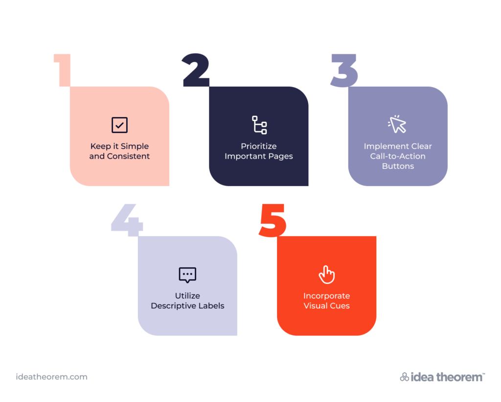
Tip 1: Keep it Simple and Consistent
Simplicity is key when it comes to navigation design. Keep the navigation menu clear, concise, and easy to understand. Limit the number of menu items to avoid overwhelming users. Additionally, maintain consistency across all pages of your website to ensure users can easily navigate between sections without confusion.
Example: The navigation menu on Apple’s website is a prime example of simplicity and consistency. With just a few clearly labeled menu items, users can effortlessly explore various product categories and find what they’re looking for.
Tip 2: Prioritize Important Pages
Identify the most important pages or sections of your website and prioritize them in the navigation menu. Place essential pages such as “Home,” “About Us,” and “Contact” prominently to ensure they are easily accessible to users.
Example: Amazon prioritizes key sections like “Shop by Department,” “Today’s Deals,” and “Your Amazon.com” in its navigation menu. This strategic placement ensures that users can quickly access popular features and products.
Tip 3: Implement Clear Call-to-Action Buttons
Integrate clear and compelling call-to-action (CTA) buttons within your navigation to guide users towards desired actions. Whether it’s “Sign Up,” “Shop Now,” or “Learn More,” CTAs should stand out visually and prompt users to take the next step.
Example: Dropbox’s website features a prominent “Sign Up” button in its navigation menu, making it easy for users to create an account and start using the service.
Tip 4: Use Descriptive Labels
Opt for descriptive labels that accurately convey the content or purpose of each navigation menu item. Avoid vague or generic terms that may confuse users. Use language that resonates with your target audience and aligns with their expectations.
Example: Airbnb uses descriptive labels like “Homes,” “Experiences,” and “Online Experiences” in its navigation menu, providing clarity on the types of offerings available on the platform.
Tip 5: Incorporate Visual Cues
Visual cues such as icons, dropdown menus, and hover effects can enhance navigation usability and guide users’ attention. Use icons sparingly and ensure they are universally understood to avoid ambiguity.
Example: The use of dropdown menus in the navigation of the Nike website allows users to explore different product categories effortlessly. Visual cues like arrows indicate the presence of sub-menus, enhancing navigation efficiency.

Creating intuitive navigation is crucial for delivering a seamless and enjoyable user experience on your website. Consequently, by understanding user behavior, streamlining navigation menus, prioritizing important pages, incorporating clear CTAs and descriptive labels, and utilizing visual cues effectively, you can design a navigation system that fosters effortless exploration and engagement.
As a result, users will find it easier to navigate through your website, leading to increased satisfaction and retention. Additionally, remember to continuously monitor user feedback and analytics to refine and optimize your navigation over time.
What’s Next
Idea Theorem is a top Toronto UI UX design agency and Software Development company based in North America. Through our empathy-driven approach, we have crafted digital products that have positively impacted over 10 million users. Our mission is to shape the digital future by delivering exceptional experiences. Contact Us if you have any questions; we will gladly help you.
—


