Successfully deliver a solution or message by designing the SaaS product for the targeted audience. Understanding the targeted audience is crucial, as it helps with developing design decisions. The key is to gather information about the audience’s demographics, decision-making process, needs and pain points. User research is a useful process to undergo, as it will provide an in-depth understanding of the targeted audience. User research tools such as personas, empathy mapping, and customer journey maps are utilized to gather information about the targeted audience.
Data and functional requirements may cause the SaaS product design to become overly complex. Complex SaaS products can ruin the overall user experience. The goal of user experience (UX) design is to meet the needs of users by improving the accessibility, usability and user interaction with a product or service.
Utilize the design thinking methodology before building the SaaS product. Design thinking helps tackles complexity issues, improving the chances to build a complex-free, successful SaaS product. Empathizing, problem identification, ideating solutions, prototyping, and testing improves the overall product significantly.
As mentioned before, user research is a useful process to utilize to empathize with the targeted audience. Empathy means to undercover the target audience’s needs and desires. Then identify the problems and users’ pain points that exist, then move forward into ideating solutions for those problems. Implement those solutions into a low or high-fidelity prototype, and get it user tested. Take time to strategically plan out the design thinking process and finalize the data and functional requirements for the SaaS product.
The SaaS product should consist of content that the intended audience is familiar with such as terminology, descriptions and data visualization. Unfamiliar content may lead to confusion when using the product.
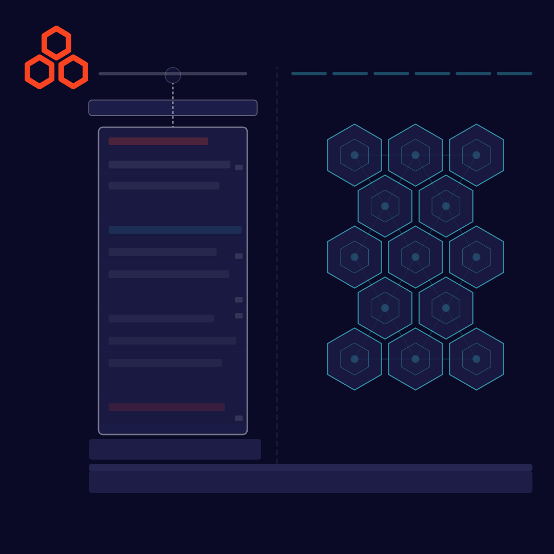
Allow users to navigate within the software easily by providing a form of navigation. Below are some useful examples of navigation for a SaaS product.
Global Navigation is a type of navigation that has consistent sets of links, tools and features allowing users to direct to the main pages in the platform. Especially useful if the product has several pages.
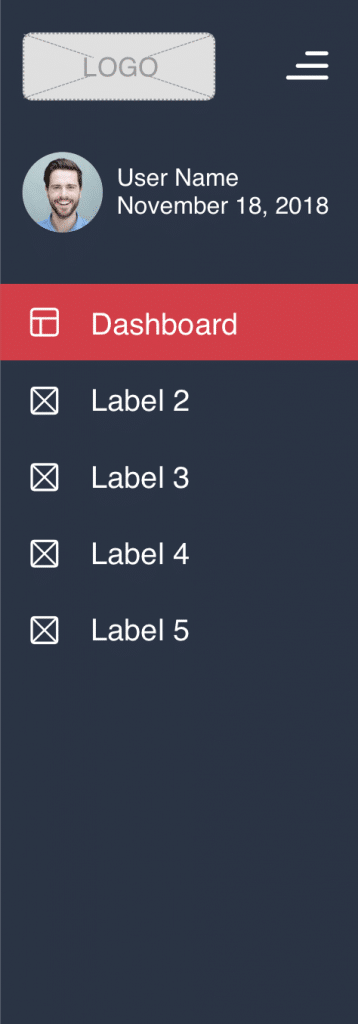
The navigation tab is useful to separate content. Navigation tabs imply that the content is somehow related, sharing the same theme.
A poorly organized layout may force users to think and look for information. Below are tips to having a good layout for the SaaS platform.
Wireframing is a good process to implement before moving forward with the final design. Create low fidelity mockups to determine where the content should be located.
Presenting too much information on a single page causes information overload, exceeding a user’s processing capability. Information overload causes users to be confused and unable to make decisions. To avoid information overload, consider utilizing the tips below.
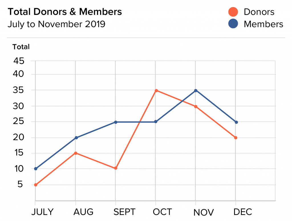
Text-based data tend to be difficult for users to understand, because of processing large amounts of data. To aid a specific audience to understand significant data, utilize data visualizations by choosing the most effective method to display the data. Data visualization helps users to understand the information quickly. Data visualization reveals insights, patterns, and trends. First, choose the type of data you want to display and then choose the type of data visualization that is best suited to display the data.
Improper use of data visualization such as using the wrong type of data visualization to display data can lead to confusion or misconception of the data being displayed.
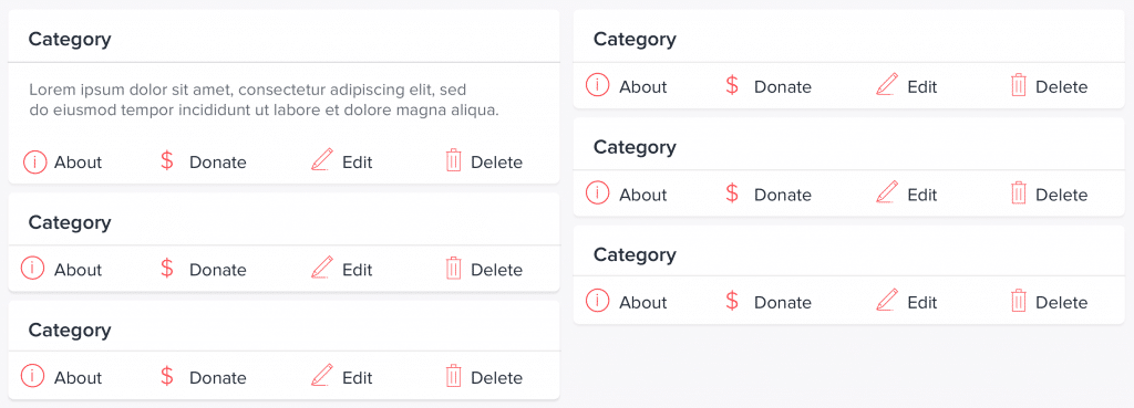
Tables organize data in rows and columns, displayed as numbers and words. Tables store data in a structured format, making it easy to compare related values.
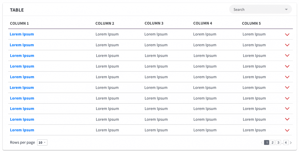
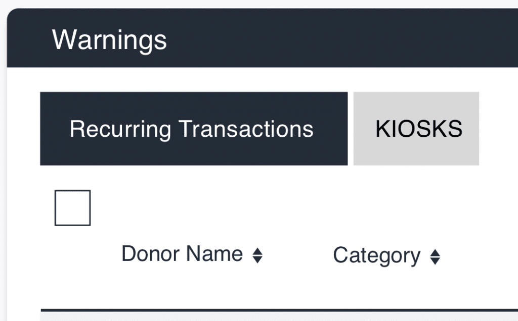
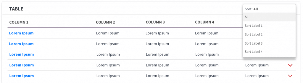
To limit large amounts of data, provide a sorting/filtering feature. Below are examples of types of sorting/filtering features.
Table Filter: To reduce the amount of data shown in a table, including a table filter. The table filter is a type of categorical filter which displays a more accurate result, often design as drop downs.
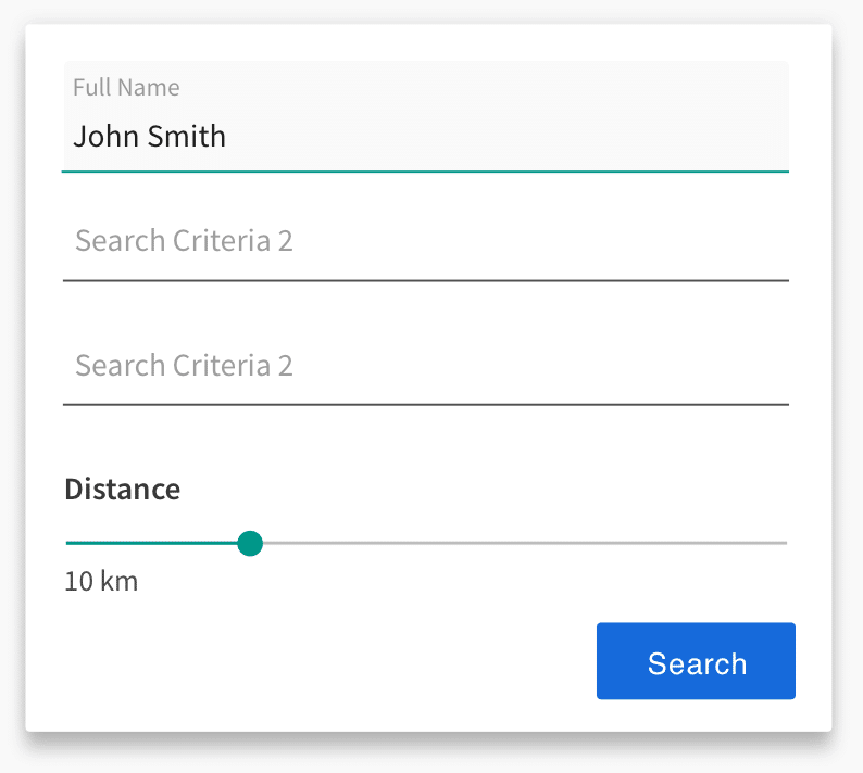
Search Filters: Designed to find certain types of data in a database, by filtering contextual filters.
Avoid using too many colors and stay consistent with the chosen color pallet on the platform. Poor color choices can distract users’ attention and make them feel overwhelmed. Tips to consider when choosing colors:
Users may require help and guidance when using the SaaS product during the onboarding phase, accessing unknown or newly updated features. Therefore, include a help and guidance feature in the platform that is easily accessible. Examples of help and guidance feature include:
At Idea Theorem, we had many opportunities to work on SaaS projects. Check out our UX Guidelines for Fintech.