
In the ever-evolving realm of digital design, user interface color holds a position of unparalleled significance. Beyond mere aesthetics, color choice profoundly influences user behavior, emotional response, and overall satisfaction with digital experiences. From websites and mobile applications to software interfaces, understanding the psychology behind user interface color is paramount for designers seeking to create immersive and impactful user experiences. In this comprehensive guide, we delve deep into the art and science of user interface color, exploring its psychological underpinnings, practical applications, and best practices for maximizing user engagement.
At the heart of effective user interface design lies a nuanced understanding of color psychology. Every hue possesses its own distinct psychological associations, shaped by cultural, biological, and personal factors. By tapping into these associations, designers can harness the power of color to evoke specific emotions, convey brand identity, and guide user interactions.
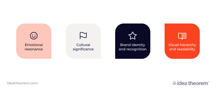
User interface color serves as a powerful conduit for eliciting emotional responses from users. Warm colors like red, orange, and yellow are inherently energizing and evoke feelings of excitement, passion, and urgency. These hues are often employed in user interfaces to draw attention to important elements or calls to action, compelling users to engage with content. Conversely, cool colors such as blue, green, and purple convey a sense of calmness, trustworthiness, and professionalism. By strategically integrating warm and cool colors, designers can evoke a balanced emotional response that resonates with users on a subconscious level.
Color symbolism varies widely across cultures, necessitating careful consideration when selecting user interface colors for global audiences. What may be perceived as positive or neutral in one culture could carry negative connotations in another. For instance, while white conveys purity in the West, it symbolizes mourning in the East. Likewise, red represents luck in Asian cultures but danger in the West. Designers must research to ensure interface colors resonate with diverse cultural norms, fostering positive user experiences.
Consistent use of brand colors is instrumental in shaping brand identity and fostering recognition across digital platforms. By incorporating brand colors into user interfaces, designers can establish a visual continuity that strengthens brand association and cultivates brand loyalty. The iconic red of Coca-Cola or the vibrant blue of Facebook instantly evoke their respective brands, showcasing the power of color in reinforcing brand identity. Moreover, leveraging brand colors in user interfaces reinforces brand values and communicates a sense of authenticity and trustworthiness to users.
User interface color plays a pivotal role in establishing visual hierarchy and enhancing readability. Through judicious use of color contrast, designers can guide users’ attention to key elements while ensuring optimal readability and accessibility. High-contrast color combinations between text and background elements improve legibility, particularly for users with visual impairments or under varying lighting conditions. Moreover, color can be used to differentiate between interactive and non-interactive elements, facilitating intuitive navigation and enhancing user engagement.

Incorporating user interface color effectively requires a strategic approach and adherence to best practices that prioritize usability, accessibility, and brand consistency.
Prioritize user-centered research to gain insights into your target audience’s preferences, behaviors, and cultural backgrounds. Surveys, interviews, and usability testing can provide valuable data on users’ emotional responses to different colors and their impact on user engagement.
Develop a cohesive color palette that aligns with your brand identity, while considering the emotional resonance of each color and its suitability for different user interface elements. Strive for a harmonious balance between brand colors and functional considerations, such as readability and accessibility.
Ensure that user interface colors meet accessibility standards, including sufficient color contrast ratios and consideration for color blindness. By prioritizing accessibility, designers can create inclusive digital experiences that cater to users of all abilities.
Iterate on your user interface color choices based on user feedback, analytics data, and usability testing. Continuously refine and optimize color combinations to improve user engagement, readability, and overall satisfaction with the digital experience.

In the realm of digital design, user interface color is a powerful tool for shaping user perceptions and behaviors. By mastering color psychology, designers can create immersive experiences that resonate with users. From eliciting emotions to reinforcing brand identity, it enhances usability and satisfaction. Embracing best practices ensures impactful digital experiences that leave a lasting impression.
Idea Theorem is a top UI UX design agency and Software development company based in North America. Through our empathy-driven approach, we have crafted digital products that have positively impacted over 10 million users. Our mission is to shape the digital future by delivering exceptional experiences. Contact Us if you have any questions; we will gladly help you.
—