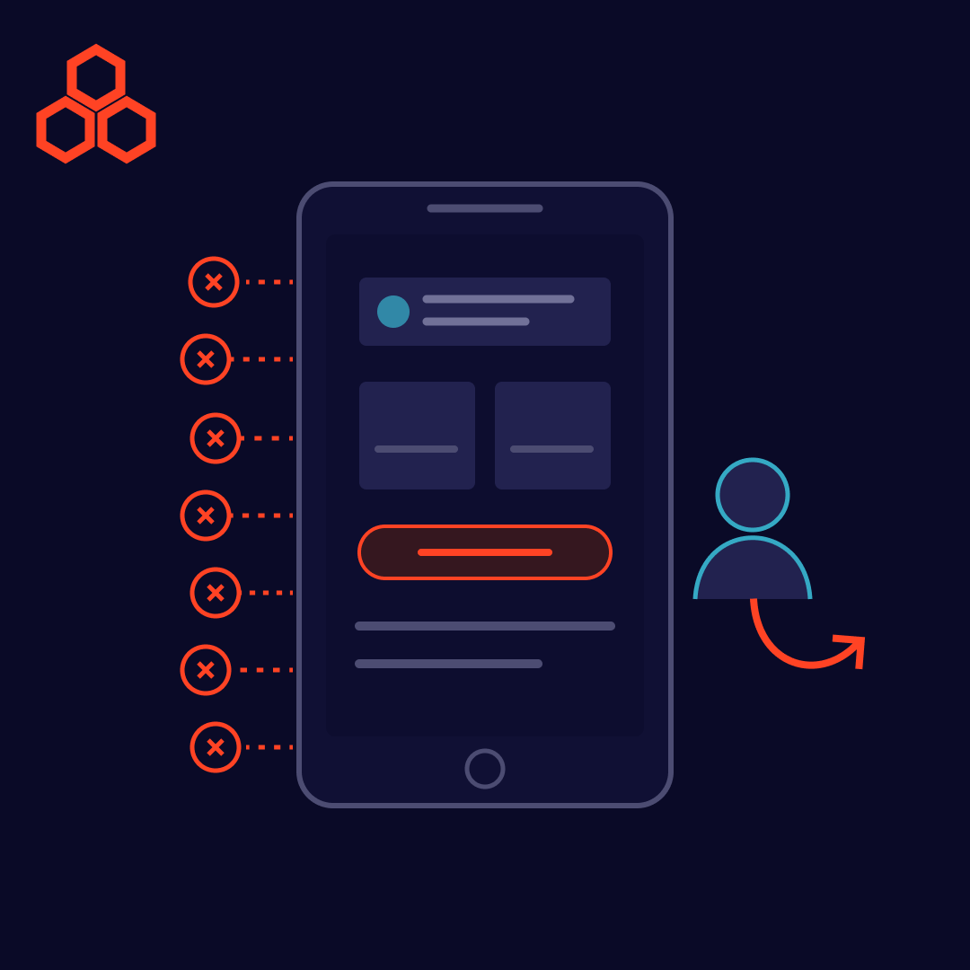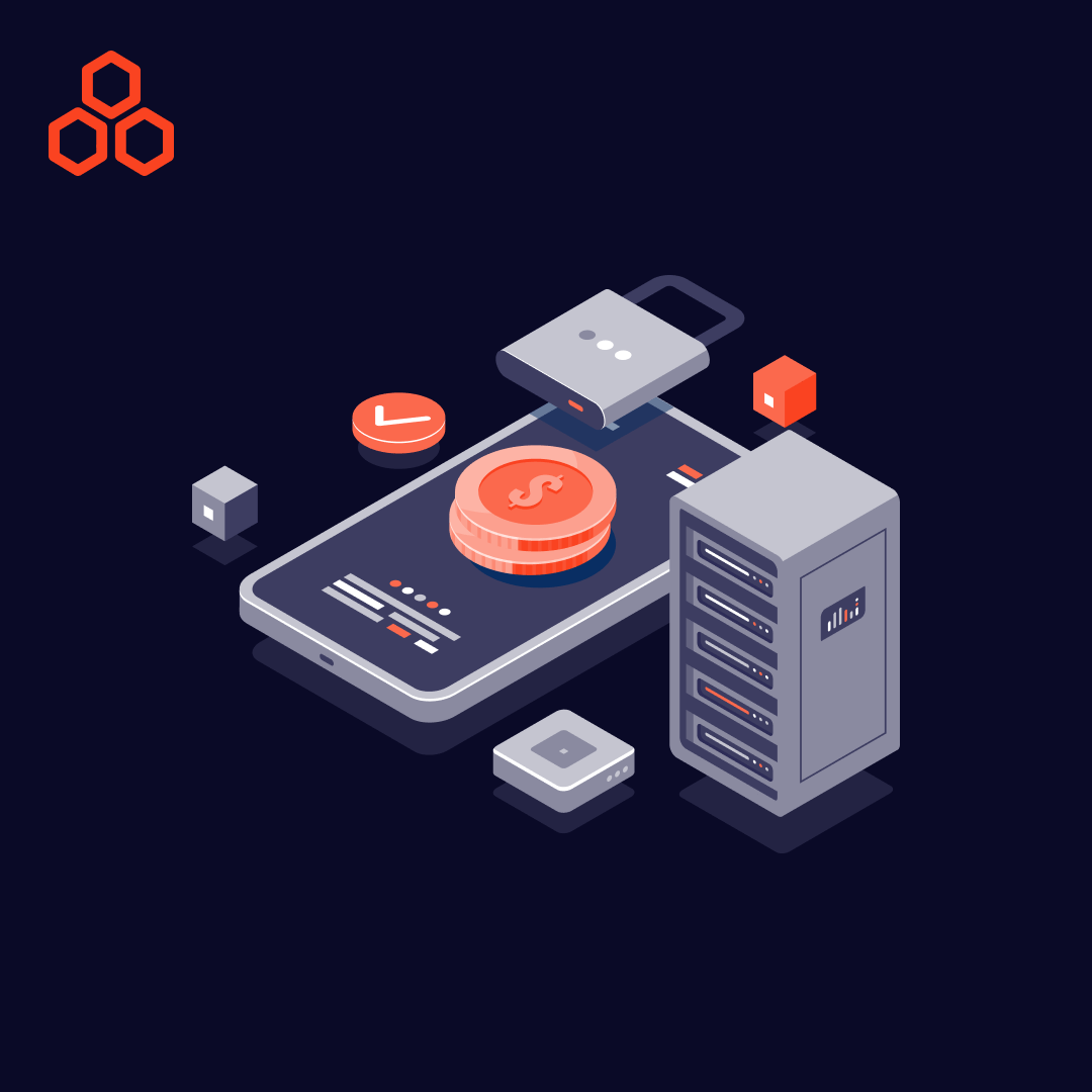
Dark Mode, also known as Night Mode or Dark Theme, has seen a remarkable resurgence in recent years across various digital platforms, including mobile apps, operating systems, and websites. This design trend boasts several compelling factors contributing to its widespread appeal.
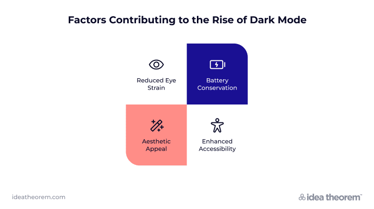
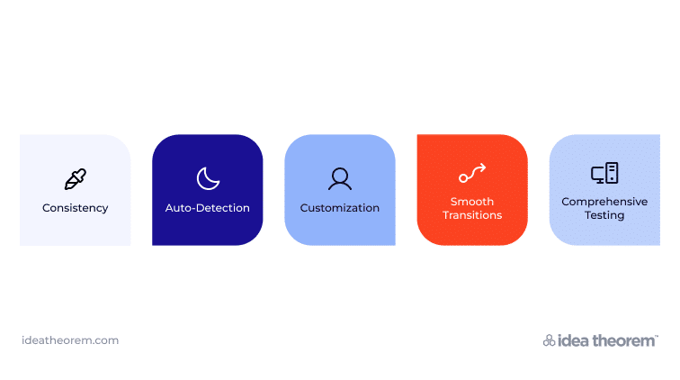
When integrating Dark Mode into your UI/UX design, consider the following best practices to optimize the user experience:
Dark Mode, whether referred to as Night Mode or Dark Theme, has gained tremendous popularity in UI/UX design due to its ability to improve user experience, conserve battery life, and cater to individual preferences. By embracing this design trend and attentively responding to user feedback, you can elevate the digital user experience with a functional and visually captivating implementation.
Dark Mode represents not only a design trend but also a commitment to user-centric design and the pursuit of optimal user experiences. As the digital landscape continues to evolve, Dark Mode has firmly established itself as a user-friendly, energy-efficient, and visually appealing choice that designers and users alike are embracing.
—
Idea Theorem is an award-winning design & development agency based in North America. Through our empathy-driven approach, we have crafted digital products that have positively impacted over 10 million users. Our mission is to shape the digital future by delivering exceptional experiences. Contact Us if you have any questions; we will gladly help you.
Dark mode is an alternate interface theme that uses darker surfaces and lighter foreground content. It should preserve the same core functionality and information hierarchy as the light theme.
No single theme suits every person or environment. Offer a clear choice, respect system preferences where appropriate and let users change the setting to match their needs.
Review contrast, text readability, icons, images and interactive states. Use deliberate surface and colour choices rather than simply inverting a light palette, and test complete workflows in both themes.
Provide an understandable control for light, dark or system-based appearance where supported. Preserve the user’s choice and keep layout and interaction patterns consistent when the theme changes.