What is a Wireframe?
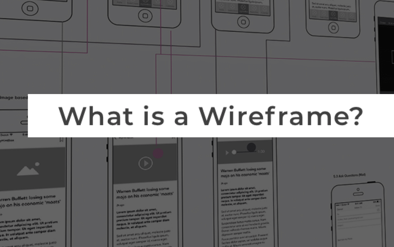
Wireframing is one of the most important processes of UX Design. A wireframe is a basic, low-fidelity layout of the product before moving to final designs. It is a visual representation using simple shapes in grayscales. Wireframes do not include styles, branding, or any graphics (as it usually clashes with the stakeholders when making a decision). Wireframes in UX design focus on the following:
- Functionalities: Determine the product’s functionality in the early stage.
- Content Prioritization: Determines how much content needs to be there. It also defines space allocation and what kind of content needs to be provided there.
- Basic User Interactions: Determines user’s interaction with the product
- Information Architecture: Determines the product’s structure and navigation.
Purpose of Wireframing and How They Should Look
The main purpose of wireframes is to get everyone on board during the product designing phase and get UX concepts cleared before the UI phase. It is an opportunity for designers, developers, and stakeholders to input any structural or functional changes. It helps in making the right decision without being distracted by colors or styles.
Wireframes should look like this:
- It Should be Devoid of Colors: Just simple black, whites and grays.
- Use Generic Fonts: Don’t spend time choosing a perfect font for wireframes. You will get enough time to do that during the high-fidelity mockup phase.
- No Graphics: Just indicate that there will be an image in this place to display how big the image should be. Graphics tend to distract from the main purpose of the website.
- Indicate Content: Don’t spend time writing the content, just add placeholder text (like Lorem Lipsum) and indicate how long the text should be.


Wireframes vs Mockups
Wireframes and mockups differ significantly. While wireframes prioritize functionality, mockups focus on aesthetics, typography, and branding. Mockups are the realistic representation of the website or app. Mockups are layered over the wireframes.
Benefits of Wireframing
Quick Feedback
Feedback can be given spontaneously. Working on the changes is easy at this stage as you are not creating an interface with branding and colors or even at a developing phase.
Clarification
Wireframes can help you get a clear picture of what will be shown on a specific page/screen and the navigation system of the product.
Focus
It lets you focus on the main aspects of the product which are content, layout, functionality, and usability.
Connect
Helps you understand what truly the stakeholders are looking for.
Time and Money
Definitely saves time and money by making most of the major decisions (for functionality, content, etc) during this phase, by avoiding any rework of design and development.
Proper Documentation
The wireframe can be shared with stakeholders and team members to make sure everyone is on the same page. Also can be referred back later, in case questions arise at a later stage of the product development.
Final Thoughts
When creating a website wireframe or wireframe app, ALWAYS keep users in mind. First, create personas through user research and then start working on wireframes. UX plays an important factor and it defines how a product will look and feel.
—
What’s Next
Idea Theorem is an award-winning design & development agency based in North America. Through our empathy-driven approach, we have crafted digital products that have positively impacted over 10 million users. Our mission is to shape the digital future by delivering exceptional experiences. Contact Us if you have any questions; we will gladly help you.


