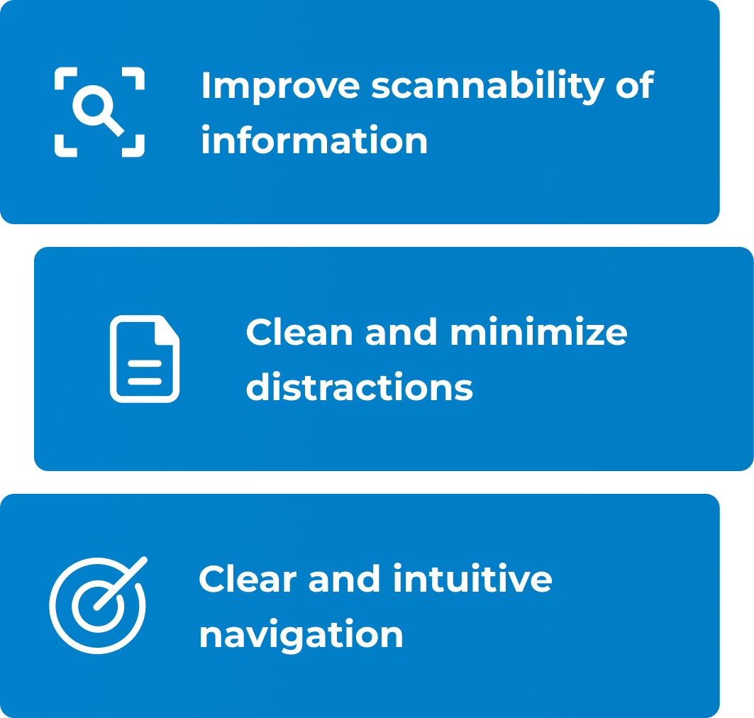
The client aimed to refresh the look and feel of RiskCheck Connect to enhance usability and visual appeal, particularly on key screens and workflows. Their primary objectives included improving user flows, enhancing scannability, minimizing visual distractions, and creating a clear, intuitive navigation system.
Risk management web application focus areas:
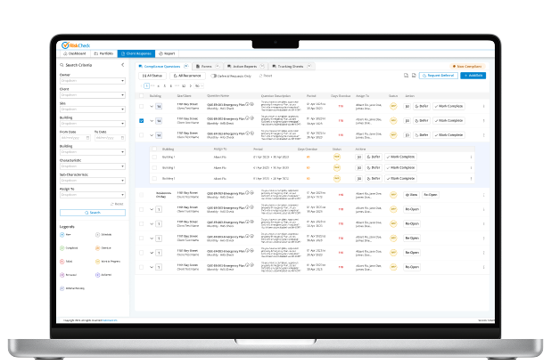
Client Response Page – Core tasks completed here, including search criteria, legend, compliance questions, expanded building view, add/edit questions, compliance indicators, forms, action reports, tracking sheets, and completing/deferring actions across key tabs.
Modals – Supporting elements such as comments, additional info, documents, legislative criteria, question history, deferrals, bulk recurrence, and bulk assignments.
Portfolio Page – Structured at Client, Site, and Building levels.
Report Page – Various report and summary exports, including Action Report, Client Compliance Report, Question History Report, Portfolio Overview Report, Form Summary, Portfolio Detailed Report, Full Task List, and Deferral Tracker Report.
Stakeholders: System Manager & Business Analyst, Director of IT, Director of Operations..
Collaborated with stakeholders to understand the existing system, identifying pain points and inefficiencies in user workflows.
Developed wireframes to explore design solutions while maintaining the platform’s core functionality.
Established a cohesive design system to ensure consistency across components and improve maintainability.
Focused on reducing cognitive load, improving accessibility, and refining interactions for a more user-friendly experience.


Established a design system to ensure consistency across all components and improve maintainability.
Reduced multiple button styles in various colours and use cases.
Cohesive taxonomy in labels so the word used is the same on all pages.
Streamlined user flows by reducing clicks and surfacing key information for quicker access.
Highlighted actions and information previously hard to notice.
Enhanced search and navigation for a more intuitive and efficient user experience.