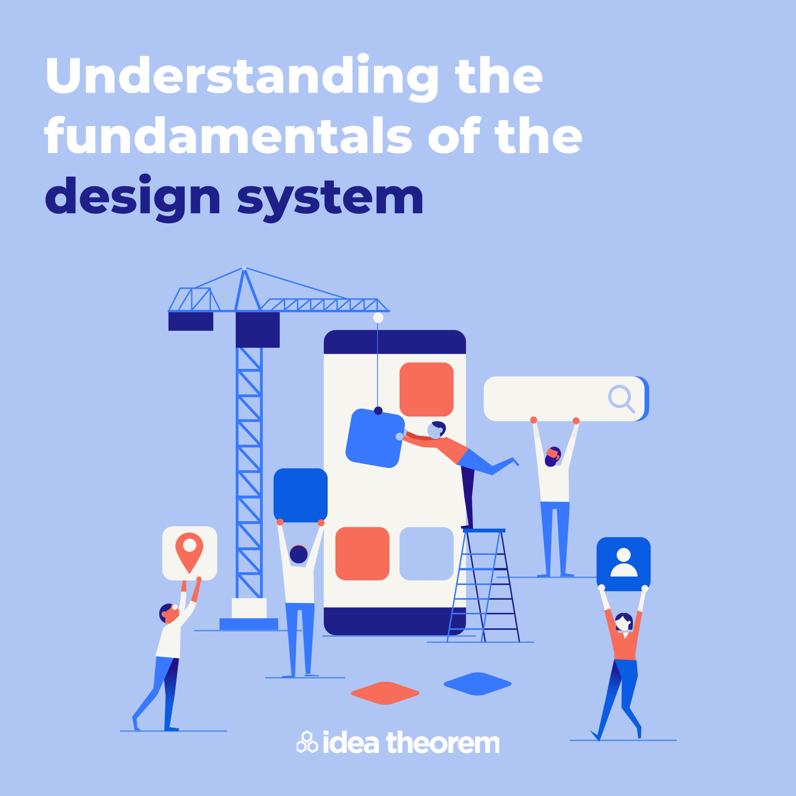
One of the challenges as your product scales is you work towards providing a standardized experience to your users. Your users start to expect specific ways that your product will behave even as you add new features to it.
To ensure a standardized experience is maintained even when you have multiple designers or developers working on the product, there needs to be a standard process and guidelines followed. If a new designer joins your team and needs to work on a new feature, they can quickly understand the standard procedure and system and start delivering the experience expected by your users.
This is where Design System comes in to help you build the guideline that can be followed by developers and designers when creating the product.
Want to drive better results from your product?
Download the Product Manager’s Guide To UX >>
One of the common misconceptions is that the:
- The Design System is only for designers – the Style Guide
- The Design System is only for developers – the Pattern Code Library
As we will learn in this post – a Design System is much more than that and plays a significant role in streamlining communication between developers and designers.
What is a Design System?
How can we deliver intuitive feelings and brand identity awareness to users throughout the product? Consistent and connecting elements help users understand and feel they are using the same brand.
The Design System is a unique guideline that follows the brand or company design style. Also, it sets minimum rules to maintain brand identity. It contains visual design elements and a pattern library that provides the standard of components that designers and developers use while they design and develop the product respectively.
The main goal of having the Design System is to increase the efficiency of the project, bring in standardization and maintain brand identity.
Why is the Design System important?
As the product grows, more designers and developers are added to the team. As every new hire comes, new ideas, patterns, and typography come into play. This can create chaos, but the system is in place to help stop that chaos and confusion. It brings consistency and increases the speed of product development.
A Design System can be beneficial for any organization, big or small. However, building a Design System takes time & effort, so here are some benefits:
Consistency
When multiple designers work together on the same project or if a new designer is onboarded in the middle of the project, they may struggle to maintain consistency in the design. Therefore, standardized design elements and UI components are created, which can be used consistently and repetitively across the platform.
Scalability
Having a Design System helps the product scale effectively. With elements already approved, it is easy for the product design and development team to create new features and expand.
Communication
The Design System acts as a single truth source that helps streamline communication between designers and developers.
Enhance User Experience
As an end-user of the product, the experience is very consistent throughout the product or products. As new features or products get launched, the user is already familiar with the product’s elements, patterns, and themes. This also helps reinforce the company’s brand – making it a double win!
What does a Design System Consist of?
Before creating the actual design system, designers should ask who will use it and how they will use it. Once they define the answer to those questions, they can start considering where to start for the design system and what to put in it.
Design Principle
Building solid design principles are the foundation for building a design system. It helps capture what good design means to the company and helps the team make meaningful decisions based on these principles.
Style Guide
Style Guide includes typography, icons, colors, spacing, illustrations, tone, and many more. Based on the style guide, users get a perspective of the brand. The Design System must define the standard on how to use each element. It should contain what to do and not do with elements and how to combine them so that designers can accurately deliver the desired product experience.
Accessibility Guidelines
The Design System should showcase the accessibility of the product. For example, it should be able to effectively define color contrast, keyboard focus and navigation, and screen readers. Learn more about accessibility guidelines here.
UI Kit
UI Kit consists of UI elements that are like LEGO blocks. They are built once and reused throughout the product by the designer to create their design. In the Design System, their functional behavior needs to be specified for the team to understand and use the elements effectively. In addition, they need to clearly state how the elements will look in different devices and screen sizes.
Master Control Library
Developers can use the UI Kit to add code and behavior to each UI element. This results in responsive and accessible code-based components which can be reusable throughout the platform. In addition, these components are tested for functionality and WCAG requirements(using a screen reader), bringing consistency and efficiency to the development team.
—
What’s Next
Idea Theorem is an award-winning design & development agency based in North America. Through our empathy-driven approach, we have crafted digital products that have positively impacted over 10 million users. Our mission is to shape the digital future by delivering exceptional experiences. Contact Us if you have any questions; we will gladly help you.


