
With governments taking measures to make products accessible for everyone, designers need to have empathy and create a different experience for different people through the same design. A well-designed product should be accessible to different users such as users with low vision, any type of blindness, motor and hearing impairments. With inclusive design, people with disabilities can perceive, navigate and interact with your product. This article is a guide to accessibility design for web and mobile. It follows guidelines and principles of WCAG 2.0.
To design a product which needs to be accessible to everyone, you must understand your audience, create a strategy by doing user research and by creating lean personas. There should be consistency in the design all throughout your product.
W3C Web Content Accessibility Guidelines (WCAG) 2.0 has created a set of guidelines and principles that designers, developers, product owners can use to make products accessible to different users. There are 4 principles of accessibility which lay the foundation for anyone to access your product.
Provided below are some guidelines that will help your product to be user-friendly for every type of users.
1. Color, Contrast, and Text
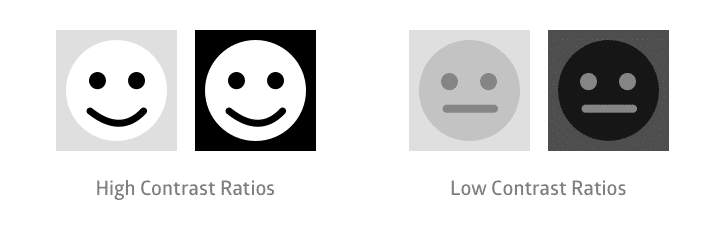
[qodef_blockquote text=”8.1 million (3.3%) have a vision impairment. These people might rely on a screen magnifier or a screen reader, or might have a form of color blindness.” title_tag=”h5″ width=”100″]
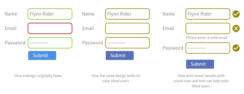
Color palette should be accessible. Poor choice of colors on the screen can cause problems for colorblind and low vision users. For these users high contrast is important. The contrast ratio between a color and its background should range between 1:21 based on the relative luminance of colors.
Users with colorblindness, can not tell the difference between the colors. So, the design should not be based on colors but use elements like patterns, texture, strokes, text, icons, animations etc. to communicate with the users.
For font contrast, 18 point text or 14 point bold text is judged to be large enough to require a lower contrast ratio which is the ratio of 3:1 for standard text and vision. Small text should have a contrast ratio of at least 4.5:1 against its background. Don’t hardcode font styles and sizes. Use em instead of px.

2. Language
Use simple language. There are plenty of users for whom English will be a second language. Write paragraphs which can be scanned easily and write more bullet points or short paragraphs. Structure pages in a way that the text can be scanned easily and people understand the sentences. Designers can use images or icons or actions to describe something for the users. Provide definitions for unfamiliar words and create helpful links for users to browse through.
3. Audio
Users should be provided with alternatives to audio like closed captions, a transcript, or other visual alternatives to critical audio elements and sound alerts (but it is best to avoid starting audio automatically, especially if the user is using audio to navigate). If any audio is being played automatically on your product for more than 3 seconds, there should be an option to pause or stop the audio or the user should be able to control the volume.
4. Focus
Focus is an important part of the accessible design for the visual layout. It should determine the order in which the elements should receive focus first. It should tell users where to move forward when the focus of the elements disappears. From the accessibility point of view, there should be a combination of visual indicators and text. The focus should transition between screens and elements seamlessly.
5. Keyboard Accessible
Keyboard accessible is beneficial for users who are blind or with low vision or with motor impairments. It means that the content should be operable using a keyboard. Ensure correct tab orders for navigation order and hierarchy. Provide both keyboard and mouse access to all functions. All elements on the screen should be able to be resized using the keyboard.
Some resources to help with accessibility design:
Always design products with people first in mind. The products are designed to bring in the users and make them happy with the content we provide.
If you have any questions regarding the requirements and standards that are needed for creating digital products, we will be happy to help you.
Idea Theorem has recently launched UX Audit services for you to understand where you are missing pieces to gain more user base. You can also check out DIY UX Audit where we have provided you with our insights that will help your business grow.
—
Idea Theorem is Toronto based UI UX design agency which creates simple and usable experiences for web and mobile.We’re recognized as a top User Experience Design Company on Design Rush. Our human-centered design approach lets us understand your customers, identify their pain points & deliver solutions that enhance their experience with your brand. Contact Us if you have any questions and we will be happy to help you.