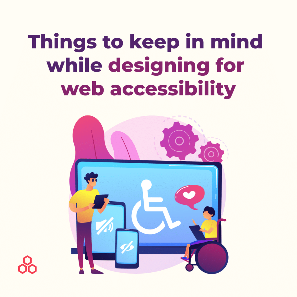
Digital products are not experienced in the same way as physical products. For example, some users with disabilities might not be able to see or recognize colors or move the mouse. This is why it is necessary to keep accessibility in mind when designing digital products.
Web accessibility has become integral to developing websites, SaaS products, and mobile apps. While creating digital products, the designers need to ensure that each element is understandable by the users or by assistive technology like screen readers.
Designing for web accessibility is the practice of designing for a wide range of people. This is for people who may have sensory, auditory, cognitive disabilities, and much more.
To avoid having to re-design and implement accessible solutions at a later stage, (especially since websites will be required to be accessible in the near future), it is best to do it from the start—design with accessibility in mind right when you are at the stage of designing screens.
Want to drive better results from your product?
Download the Product Manager’s Guide To UX >>
Web accessibility is becoming an essential part of the design, ensuring that websites and applications are accessible for everyone, including users with disabilities. Good design does not just mean making something look good visually; it also needs to function well. For example, can a person who uses a screen-reader use your website as intended? If not, do you think that person would consider your site well-designed? As designers, we are responsible for creating usable digital work that provides a great experience.
Not only people with permanent disabilities will benefit from your accessible design. It will also help those with temporary and situational conditions. Therefore, when you design for accessibility, you design for everyone.
Accessibility Guidelines (WCAG) 2.1 site is a guide to WCAG 2.1, helping businesses to easily comprehend the guidelines and principles of WCAG 2.1. We will introduce some guidelines for meeting WCAG 2.1 regulations, which you can apply to future designs.
Depending on how you use the color in your design, your design can be considered good or bad. Color usage affects not only users with color blindness or low vision but also others with varying vision common problems. For example, users may have difficulty reading the text if the background and text color do not have enough contrast.
Therefore, providing more than a minimum contrast between text and the background increases the readability of the reader. Furthermore, smaller text requires higher contrast than larger text.
If you are unsure how to check the contrast on your design, there are a ton of contrast checkers in the form of plugins for Figma, Sketch, and web browsers. Use those plugins to check the contrast.

Checklist:
Reference:
1.4.3 Contrast (Minimum) (WCAG 2.1 Level AA)
1.4.11 Non-text Contrast (WCAG 2.1 Level AA)
Keyboard controls should be able to access all the contents on the page for users who are limited to using the keyboard only. Some users must rely on assistive technologies to navigate throughout the site. If some of the contents are not accessible using the keyboard, they will, unfortunately, miss the content they were looking for.
If you are unsure if your design meets all those requirements, try to use only your keyboard to navigate throughout the design. This way, you will be able to see whether it is accessible with a keyboard or not.
Checklist:
Reference:
2.1.1 Keyboard (WCAG 2.1 Level A)
2.1.3 Keyboard (No Exception) (WCAG 2.1 Level AAA)
2.4.7: Focus Visible (WCAG 2.1 Level A)
A straightforward layout and hierarchy allow users to gather the core information quickly at a glance. However, when you form the structure of the information on the page, you must remember to structure it logically.
Users learn functionality while using the website and expect consistent functionality throughout the site. Also, for those with cognitive or learning disabilities or using a screen reader, the page layout and the organization of the contents must be well structured. To help them to understand the content, try to group associated items.
Checklist:
Reference:
3.2.3 Consistent Navigation (WCAG 2.1 Level AA)
3.2.4 Consistent Identification (WCAG 2.1 Level AA)
2.4.6 Headings and Labels (WCAG 2.1 Level AA)
Giving more room for text spacing increases readability. Tracking is often measured as a percentage of font size and having 130% to 150% for tracking is optimal. To find the proper tracking, try different percentages and choose the one you think works best for you.
Low vision users can read better and faster with increased line, letter, and paragraph spacing. To make your text more readable, these are the suggested text properties to apply:
Checklist:
Reference:
1.4.12 Text Spacing (WCAG 2.1 Level AA)
According to Wikipedia, Color blindness (color vision deficiency) is the decreased ability to see color or differences in color. It can impair such tasks as selecting ripe fruit, clothing, and reading traffic lights, among other things. It affects approximately 1 in 12 men (8%) and 1 in 200 women worldwide. Therefore, designers must keep that in mind while designing digital products for the color-blind population.
There are different types of color blindness including:
The designs should not be dependent on the colors to understand. A caption or description should follow any color-based component. Try adding a pattern, texture, or underline to help create a contrast between different components.”
—
Idea Theorem is an award-winning design & development agency based in North America. Through our empathy-driven approach, we have crafted digital products that have positively impacted over 10 million users. Our mission is to shape the digital future by delivering exceptional experiences. Contact Us if you have any questions; we will gladly help you.