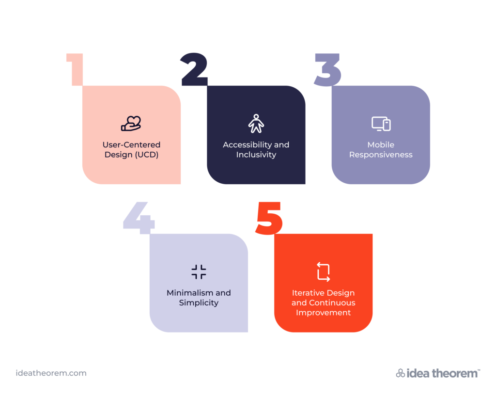
In today’s fast-paced digital world, user experience (UX) design plays a pivotal role in shaping how people interact with websites, apps, and digital products. A seamless and intuitive user experience can make all the difference between a product’s success and failure. Let’s delve into five key UX design principles
that drive effective user experience, with real-world examples and case studies to illustrate their importance. These foundational principles of UX design help teams align on what matters most to users.

1. User-Centered Design (UCD)
Principle
User-centered design (UCD) revolves around putting the needs and preferences of users at the forefront of the design process, a core example within the principles of UX design. Additionally, by understanding users‘ behaviors, goals, and pain points, designers can create solutions that meet their needs effectively.
Examples
Slack, a popular team collaboration platform, embodies the principles of UCD. The company conducted extensive user research to understand how teams communicate and collaborate. As a result, Slack’s interface is intuitive and customizable, allowing users to organize conversations and tools according to their workflows.
Airbnb redesigned its website and mobile app with a focus on user-centered design principles. Moreover, by conducting user interviews and usability testing, Airbnb revamped its search and booking process, making it easier for users to find and book accommodations. The result? A more intuitive and personalized experience that significantly boosted user engagement and satisfaction.
2. Accessibility and Inclusivity
Principle
Accessibility and inclusivity in UX design ensure that digital products are usable by people of all abilities. Furthermore, designing with accessibility in mind an essential part of the principles of UX design involves providing alternative means of interaction for users with disabilities, thereby ensuring equal access to information and functionality.
Example
The inclusive design approach adopted by Apple is evident in its VoiceOver feature, which provides spoken descriptions of on-screen elements for visually impaired users. Additionally, by integrating accessibility features into its products, Apple enhances usability for users with disabilities without compromising on aesthetics or functionality.
The BBC redesigned its website to comply with accessibility standards and enhance usability for all users. By implementing features such as resizable text, keyboard navigation, and screen reader compatibility, the BBC ensured that its content is accessible to individuals with visual impairments, motor disabilities, and other accessibility needs.
3. Mobile Responsiveness
Principle
With the proliferation of mobile devices, designing for mobile responsiveness is essential. As one of the practical UX design principles, this ensures a consistent and optimized user experience across different screen sizes and orientations.
Example
The responsive design approach employed by Google’s Material Design framework enables seamless transitions between desktop and mobile interfaces. Google’s apps, such as Gmail and Google Maps, adapt fluidly to various screen sizes, providing a consistent experience regardless of the device.
Starbucks revamped its mobile app with a focus on mobile responsiveness and usability. By optimizing the app for smartphones and tablets, Starbucks improved navigation, streamlined the ordering process, and enhanced overall user experience. The result? Increased mobile app usage and higher customer satisfaction.
4. Minimalism and Simplicity
Principle
Among the principles of UX design, minimalist design emphasizes clarity, simplicity, and efficient use of space to reduce cognitive load and enhance usability.
Example
The minimalist interface of Dropbox’s website and app prioritizes essential actions and features, thereby making it easy for users to store, share, and collaborate on files. Additionally, by eliminating unnecessary elements and focusing on functionality, Dropbox delivers a streamlined user experience that resonates with its users.
Apple’s design philosophy, characterized by clean lines, intuitive layouts, and minimalist aesthetics, permeates its products and interfaces. Moreover, from the simplicity of the iPhone’s home screen to the minimalist design of the Apple website, Apple prioritizes user-centered design principles to create memorable and intuitive experiences.
5. Iterative Design and Continuous Improvement
Principle
User experience design is an iterative process that involves gathering feedback, making iterative improvements, and continuously refining the user experience based on real-world usage and evolving user needs.
Example
Facebook regularly updates its platform based on user feedback and usage data. Additionally, through A/B testing, user surveys, and analytics, Facebook iteratively improves features, interface elements, and algorithms to enhance user engagement and satisfaction.
Spotify employs agile methodologies and user feedback loops to continuously iterate on its music streaming service. Furthermore, by analyzing user behavior, preferences, and listening habits, Spotify refines its recommendation algorithms, user interface, and personalized playlists. This ensures the delivery of a tailored and immersive music experience for millions of users worldwide.

In conclusion, effective user experience design is guided by principles that prioritize user needs, accessibility, simplicity, and continuous improvement. By incorporating these UX design principles into the design process and leveraging real-world examples and case studies, designers can create digital experiences that resonate with users, foster engagement, and drive long-term success.
What’s Next
Idea Theorem is a top Toronto UI UX design agency and Software Development company based in North America. Through our empathy-driven approach, we have crafted digital products that have positively impacted over 10 million users. Our mission is to shape the digital future by delivering exceptional experiences. Contact Us if you have any questions; we will gladly help you.
—


