The onboarding experience is the initial process that users engage with. It is one of the most important stages of every product for user experience. If done successfully, an onboarding experience can define the value of the product in 5-6 screens and entice a user to keep engaging.
This process is an overview to let users know about the product and its features. It also answers the following user questions:
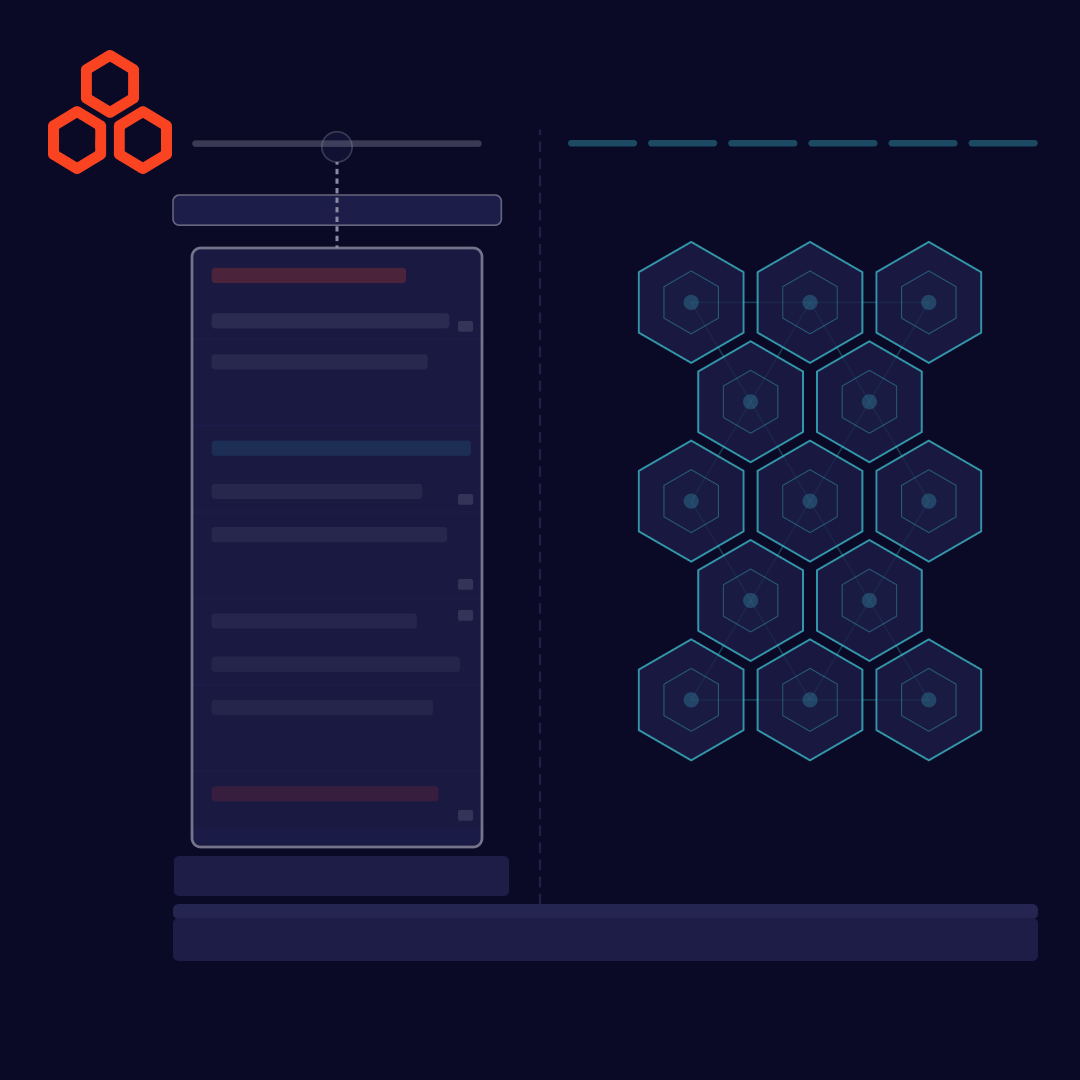
Designing for an effective onboarding experience is vital as it can result in greater returns. According to Dan Wolchonok, Head of Product and Analytics at Reforge described how Week 1 has the highest user retention (the action of users to hold the most attention or information).
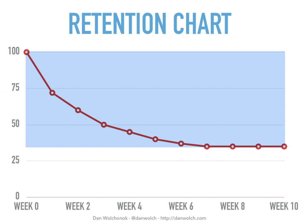
Dan Wolchonok demonstrates through this chart that user retention is the highest point between Week 0 and Week 2
Furthermore, the main reasons why users decide to leave after week 1 is due to not seeing the value or not understanding the product. This indicates that the product did not sell itself to the user in such a vital time.
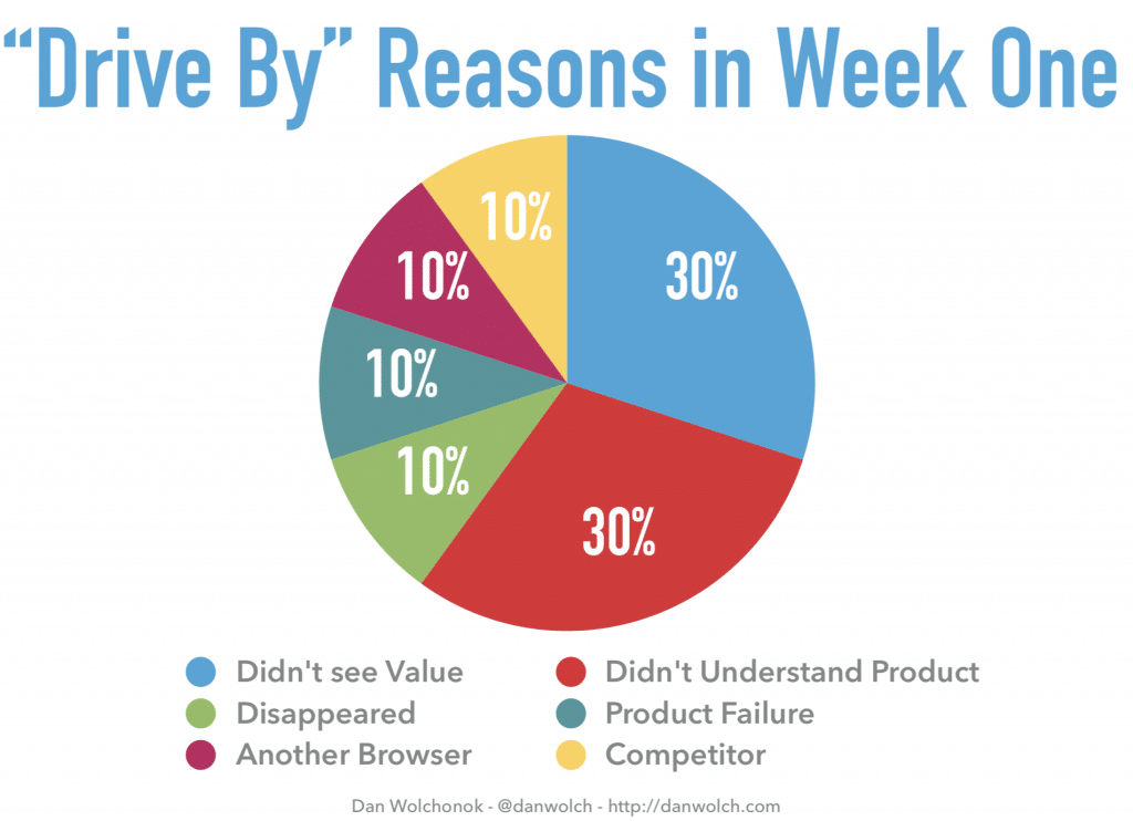
Dan Wolchonok uses a chart to demonstrate the different percentages of why people stop engaging with a product after Week1
With a successful onboarding experience, you can find a 15% increase in Week 1 retention, demonstrating just how important it is to optimize the onboarding experience of a product.
In this blog, we will be discussing 10 tips on how you can improve the onboarding experience!
#1 START FROM SCRATCH
Designing for a successful onboarding experience means to hold no assumptions. It is important to start from the beginning and research information that can tell you more about your users.
It is beneficial to know the psychology of the users whether they comprehend or engage with the onboarding experience. This will define the user experience of your product.
Learn more about “why user experience is important and the factors that define it” here.
This can also give you an idea of which information is more necessary to include. Remember! An onboarding experience isn’t meant to be 15 minutes long, short and concise is the point!

#2 MAP IT OUT
Understanding a user means to be able to understand the pathway that the user will take to achieve the goal. A good way to get this done is to map it out on a customer journey map.
A customer journey map can tell you the pivotal moments that run through a user’s mind as they make their way through the onboarding experience. Make sure to take note of these key moments as this will tell you how it will affect user experience.
Learn more about customer journey mapping here.

#3 SHORT AND CONCISE IS KEY
Remember that this product may be unfamiliar, which means having a short and concise onboarding experience will be more effective.
Users do not want to be overloaded with information, especially like reading like a school textbook. This will result in bad user experience and push a user to halt engagement. Keep it short and concise, this is more convenient for users.
Therefore keep your screens to no more than 6!
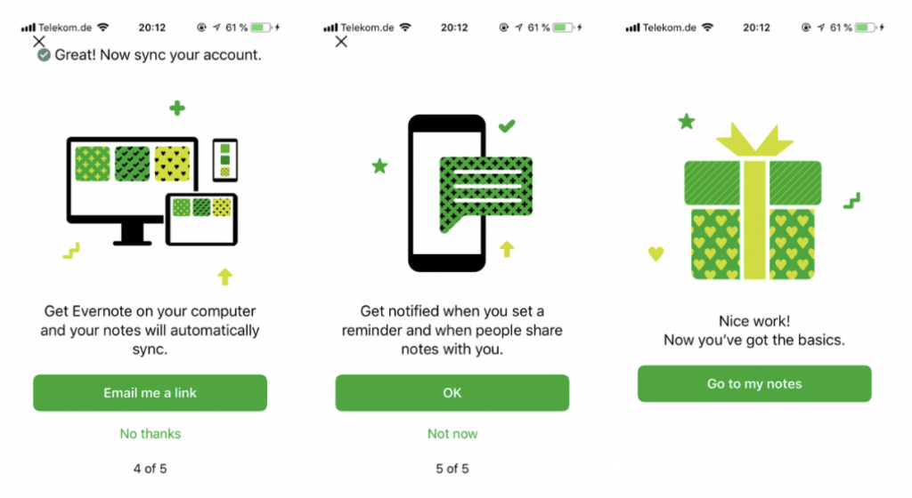
Evernote’s onboarding experience uses short and simple sentences.
#4 WHY AND WHEN MATTERS
Why should I grant access? Why should I make an account? These are questions that will run through the mind of the user if there is no clear explanation in the start.
In addition to explaining why it is also important as to when. It is always better to give users enough space to learn more about the product and what advantages are there. Otherwise, a user is more likely to say no and end the process versus continuing forward.

Evernote’s onboarding experience explains as to why permission is needed and the benefit of allowing this.
#5 KEEP IT CONSISTENT
It is important to have your onboarding experience stay consistent with the overall brand. This means using the same colours, tone, language, and visuals. Maintaining a consistent concept all throughout demonstrates a cohesive brand and identity and help users grow more familiar with your product. This is essential especially for first-time users as they are already unfamiliar with the product.
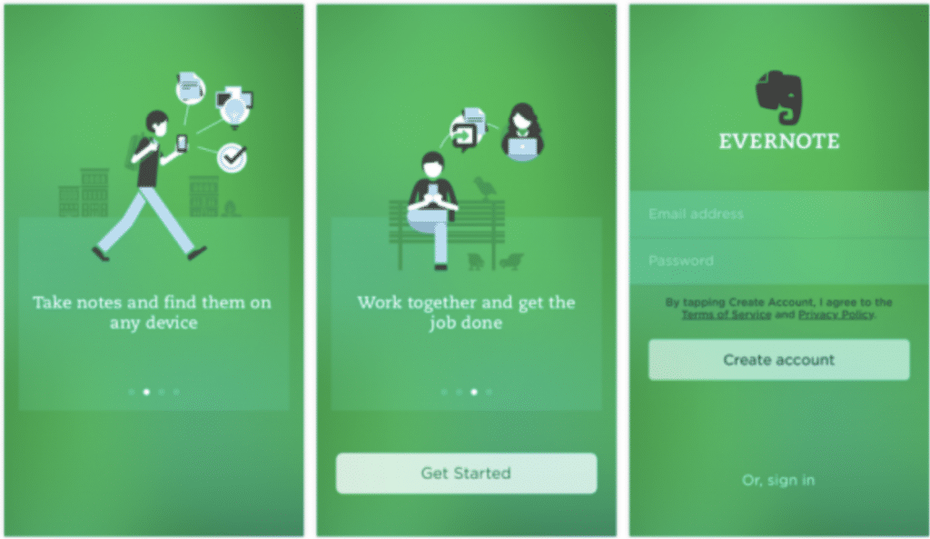
Evernote sticks to their attractive branding colours and tones
#6 USING ANIMATIONS
Using animations for your onboarding experience can always be more engaging than a static scroll through. It can be more engaging and grab more attention. However, be careful as sometimes too many animations can be distracting or annoying!
#7 USE HINTS
After a brief walkthrough, remember the user is still learning. When they finally enter and begin using your product, they may not remember the functionalities that were explained prior.
Try to use contextual hints for primary features, to remind users what these buttons or actions are for.
However, just like having too many animations are annoying, so are too many hints. Users will still want the freedom to explore on their own as they continue to interact with the product.
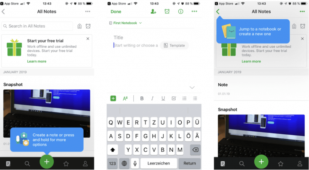
Evernote continues to provide contextual hints to the user which allows for clear understanding between product and user.
#8 RECOGNIZE USER ACHIEVEMENTS
People, in general, appreciate when achievements are recognized. The added recognition can give users an idea that they are on the right track and will make them more willing to continue onwards, increasing user engagement and user experience.
This could mean recognizing their ability to move onto the next step of the onboarding process or even just successfully completing a task.

MailChimp sets a great example in recognizing user achievements.
#9 PROVIDE A SKIP BUTTON
It is always important to give users an option to opt-out of the onboarding experience. Some users may prefer to skip as
Providing an option to skip can be more convenient as this puts them in the driver’s seat. The user should always have the choice to leave or stay.
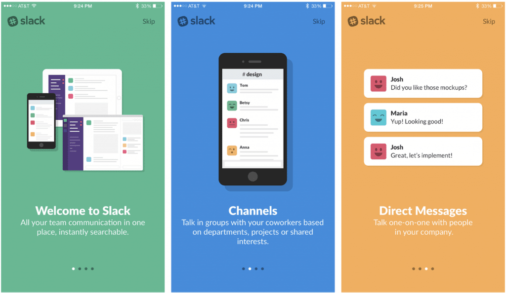
Slack has an onboarding experience that allows users to skip at any time.
#10 TEST YOUR ONBOARDING
Designing for an onboarding experience can be difficult. With lots of forethought into the planning and development phases, it can result into a successful onboarding experience.
Once completed it is essential to test it and always observe if there is room for improvement. Make sure to keep in mind the customer journey map, as well as the needs and pain points of your users.
Conclusions
When it comes to designing a product, onboarding experiences are just as important as creating a great user experience. Remember that this is the initial interaction with a user and can either promote more user engagement or halt it altogether.
A successful onboarding experience will require effort but it is completely worth it in the end!
———————
Idea Theorem is a Toronto based UI UX Agency. We create simple and usable products for web and mobile. Our human-centred design approach lets us understand your customers, identify their pain points & deliver solutions that enhance their experience with your brand. Contact Us if you have any questions and we will be happy to help you.
To know more about UX design, Interaction Design Foundation (IDF) has a huge collection of content and literature which you can view here.