“Unlike real paper, our digital material can expand and reform intelligently. Material has physical surfaces and edges. Seams and shadows provide meaning about what you can touch.”
Matías Duarte, Vice President of Design, Google
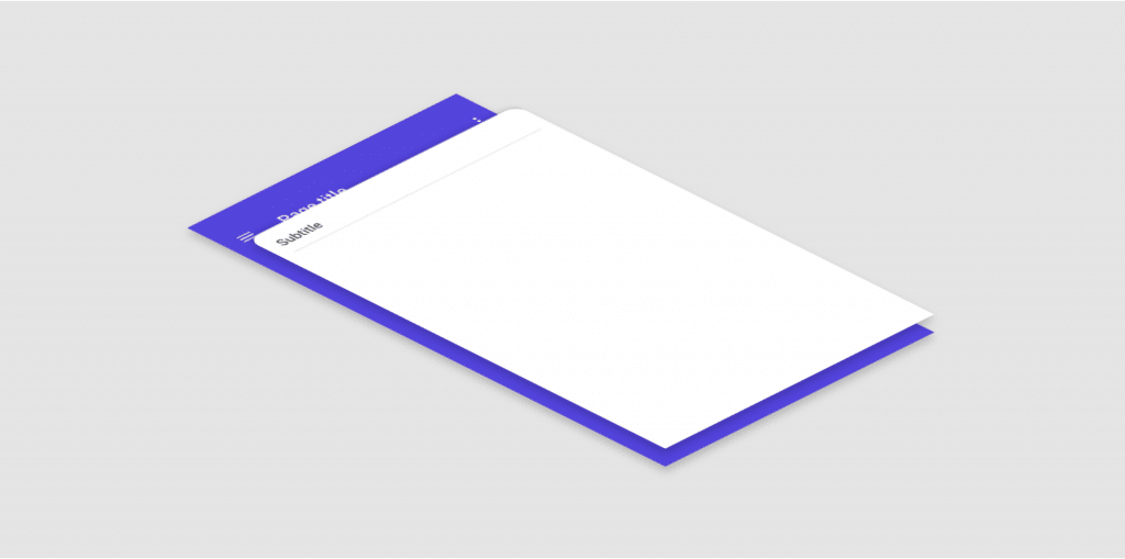
Material is a metaphor of paper. It is a flat surface that can hold content, cast shadows and stack on top of other surfaces. It also has the capability to expand and shrink in size.
Material Design has detailed guideline about how a component should look and behave.
The guideline includes font sizes, dimensions, margin and padding for each component. Following these specs will help you create layouts that look familiar to users. An easy way to apply Material Design is to utilize a material library. A material library allows you to save time designing individual components and focus more on the overall experience, workflow, and branding. At the end of this article, you will find a list of useful material libraries.
Tip:
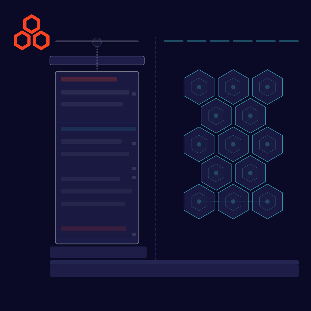
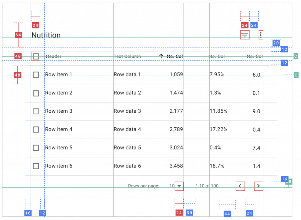
Have you ever wondered about the meaning of the red, blue and green color in the specs? Click on the image to reveal more details. Here you can view the measurements, font size, and weight, corner radius and elevation. You can even manually measure elements using the ruler tool at the bottom of the page. On this page, you can find all the relevant details to reproduce the component.
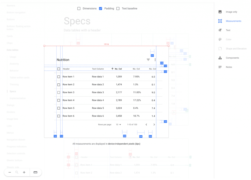
Measure
Material Design uses density-independent pixels (dp) as its unit of measure. As the name suggests, this measure is independent of the screen density (dpi: dots per inch). It ensures components all look the same regardless of the screen dpi.
Elevation
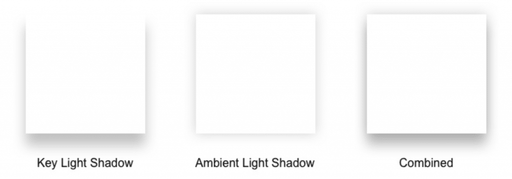
The concept of elevation is fundamental in Material Design. When a layer is elevated from the surface, it will cast a shadow. The shadow is cast by two light sources: ambient light and key light. Ambient light shadow looks soft and goes in all directions, while the key light shadow is directional and sharp. A combination of key light and ambient light shadow creates the realistic looking for an “elevated surface”.
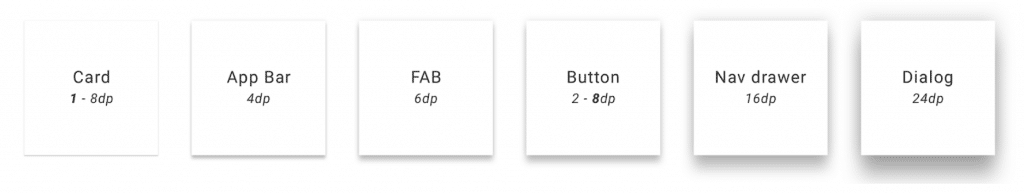
In Material Design, all components have a predetermined elevation value indicated by dps. A 1dp elevation means the distance between the top and bottom surface is 1dp along the z-axis.
A component with a higher elevation value will draw more attention because it appears closer. For example, a floating action button is a primary action on a page, and it has a 6dp elevation, higher than elevation for other components like cards (1dp) and app bars (4dp).
Following the elevation, values will create a familiar environment as users have seen most of the components and know what to expect.
Density
Enterprise products usually have a massive amount of data and require efficiency to location information. Hence high information density is often preferred in enterprise products. Learn more about Dashboard Design Guidelines for enterprise products.
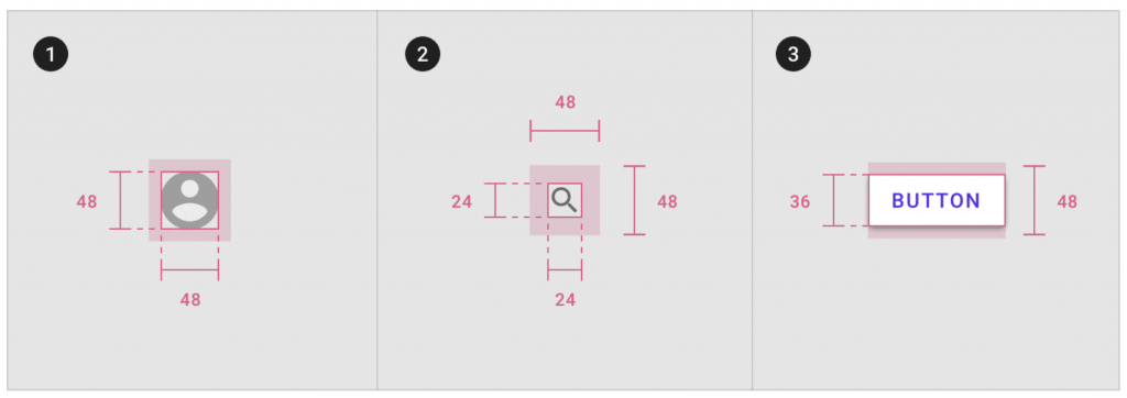
Material Design provides the option to achieve high information density without reducing usability. Material Design specifies where to apply density (data tables and lists), and where not to (pickers and dialogs). While the guideline does not provide high-density specs for each component, It highlights the touch target minimum (48 x 48 dp). Keep in mind the minimum touch target when applying density will ensure users can effectively interact with the system.
Components
Knowing what components Material Design has for navigation, content, controls, and feedback will allow you to bring creativity and more freedom to the design.
Navigation Components
An application can have one or multiple navigation components at the same time.
Content Components
Content components act like holders for contents in different formats.
| Component | Content Type |
| Card | All other components (pretty much) |
| Image list | Images |
| List | Images, text (primary, secondary, metadata), controls, dividers |
| Data table | Text, numbers, controls, tooltips, menus, text boxes, icons |
| Sheets (bottom & side) | Icons, text, controls, dividers |
Alert / Feedback Components
| Component | Obtrusiveness |
| Snackbar | Low |
| Banner | Medium |
| Dialog | High |
Selection / Control Components
If you’re designing for mobile, you can find many options to enhance usability. For example, You can choose from a navigation drawer, a backdrop, tabs or a bottom bar to define the navigation structure for your application. You can also use a contextual app bar for task-specific actions, and expendable cards for progressive disclosure. Learn more about Mobile App Design.
It is important to ensure consistency across different screen sizes. Material Design uses responsive grids with 4-column, 8-column and 12-column grid layout at different breakpoints. A breakpoint is a screen size at which the layout needs to be adjusted to fit the screen. For example, when moving from mobile to tablet, the grid will change from 4-column to 8-column, and UI elements need to be reorganized in a consistent way.
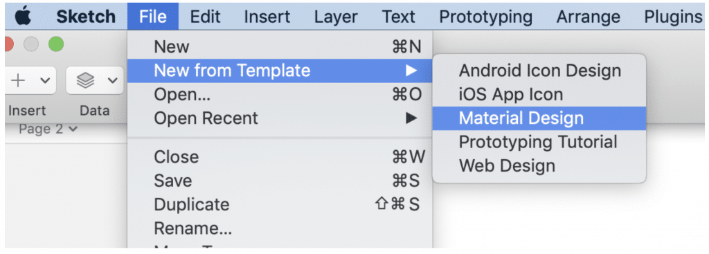
Sketch Material Design template
The Material Design Template in Sketch is a handy library to quickly find components like controls, cards and dialogs. It saves time since you don’t have to reproduce a component from scratch.
Sketch Theme Editor
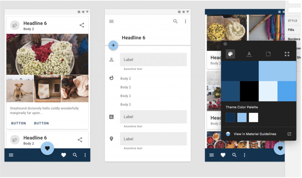
The sketch theme editor is a great tool to quickly visualize your branding style. You can change the theme color, typeface and corner style utilizing the options on the theme editor panel and see it apply to all screens in the document. You can easily get a sense of overall look and feel for your product with this plugin.
In this Material Design UI Kit you can see how each component would behave on a real application.
———————
Idea Theorem is a Toronto based UI UX Agency. We create simple and usable products for web and mobile. Our human-centred design approach lets us understand your customers, identify their pain points & deliver solutions that enhance their experience with your brand. Contact Us if you have any questions and we will be happy to help you.