Green P Parking, the Toronto Parking Authority

Try Green P
The Toronto Parking Authority partnered with Idea Theorem to conduct customer research for our updated Green P App. The Idea Theorem team worked efficiently to host focus group sessions, and supported on conducting a customer survey to gather and synthesize insights and recommendations in a digestible and insightful manner. This helped TPA determine the best approach for launch, and identify areas to focus in on for future improvements. The team was communicative, collaborative, and responsive throughout the work – thank you.​
Sasha Rana
Director, Customer Experience & Marketing​
Service

Customer Research & ​Experience Design

Platforms

iOS, Android

Industry

Finance

The Challenge

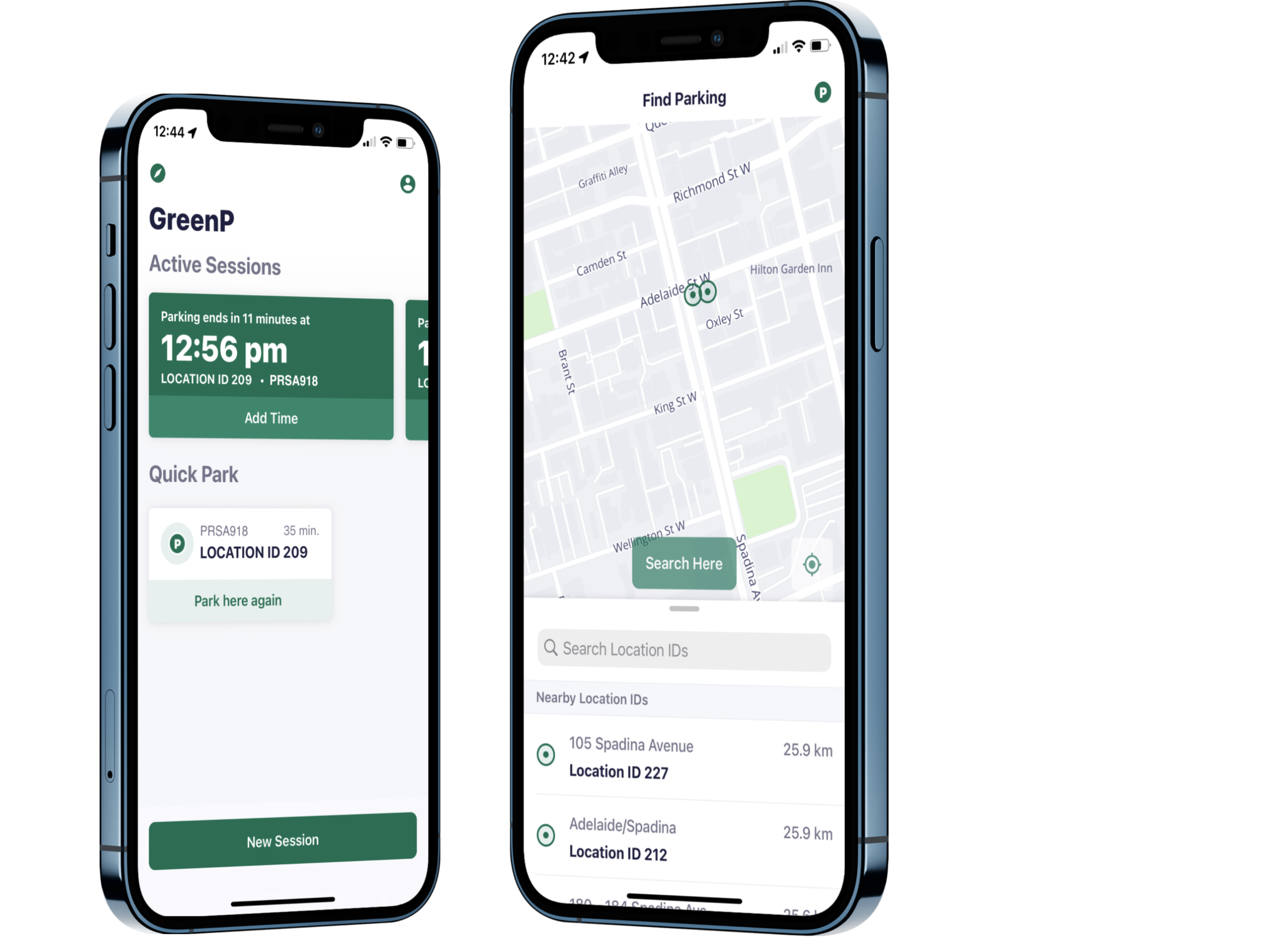
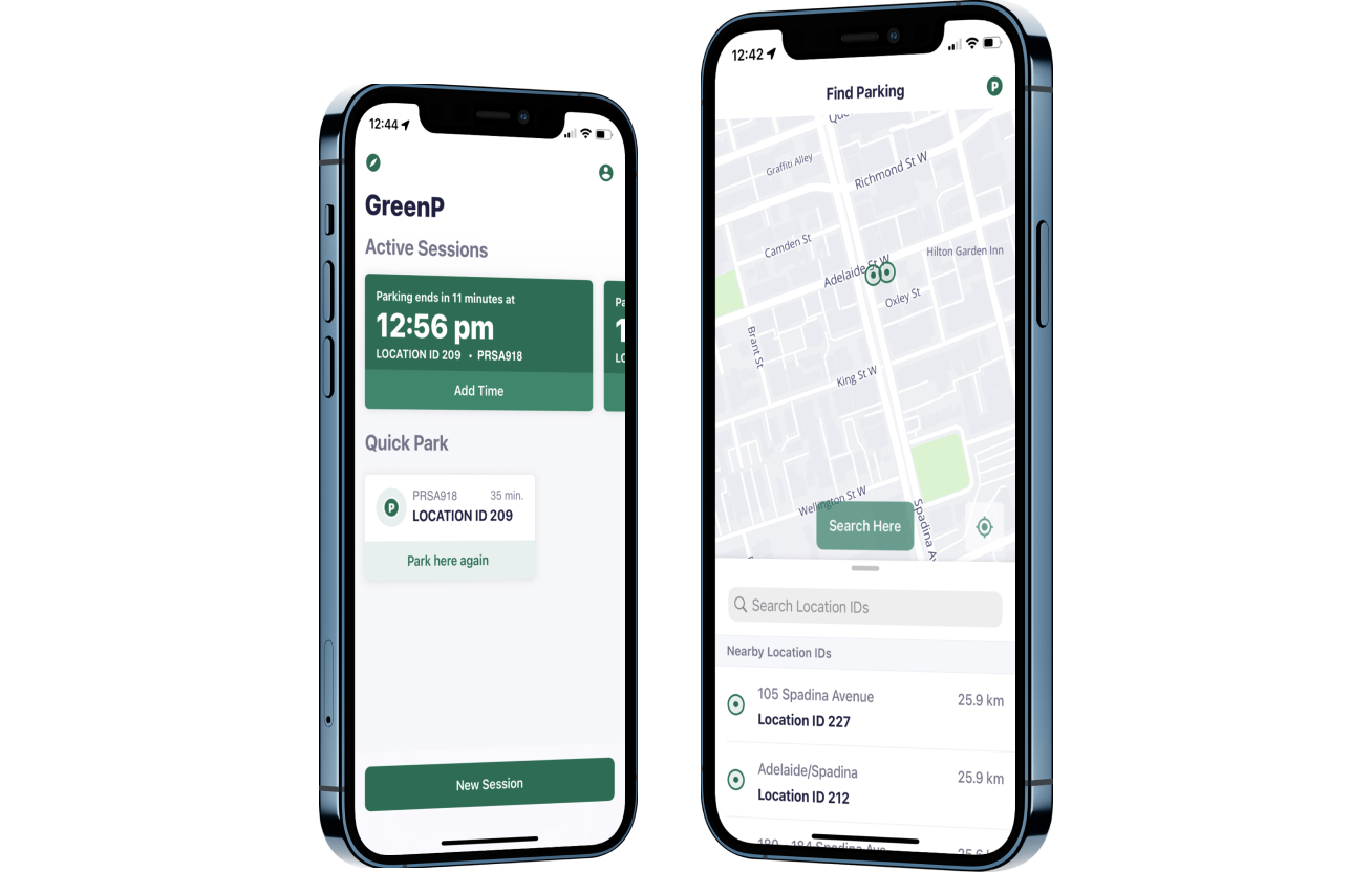
The City of Toronto embarked on a mission to revamp the User Interface (UI) of its widely-used Toronto Green Parking Application, aiming to elevate User Experience (UX) and enhance the overall Customer Experience of the app. The comprehensive audit and improvement overhaul we executed were in line with executive directives to boost usability and surpass competitors, while also integrating new features into the app.

Furthermore, our efforts were concentrated on refining the app’s aesthetics to better align with the brand image, conveying a more customer-centric message and ensuring a delightful user experience (UX). This endeavor necessitated the expertise of a seasoned Mobile App Design and Development Agency, dedicated to delivering optimal functionality and user satisfaction.

Our Approach

Usability study and Focus Group

Usability study and Focus Group

Our team initiated the project by conducting a usability study and assembling a focus group to assess the newly overhauled application UI with real users. 

User Survey and Participant Categories

User Survey and Participant Categories

We surveyed 58 active users of the updated application, focusing on those who had completed at least one transaction in the last month. Our subsequent focus group comprised 26 individuals categorized as Current Green P App Users, Potential New Users, and Participants who use competitor apps. 

User-Centric Improvements

User-Centric Improvements

The focus group provided valuable insights, with most participants expressing satisfaction with the new design. Their feedback led to user-focused improvements and feature suggestions that were integrated into the final design. 

Enhancements and Added Features

Enhancements and Added Features

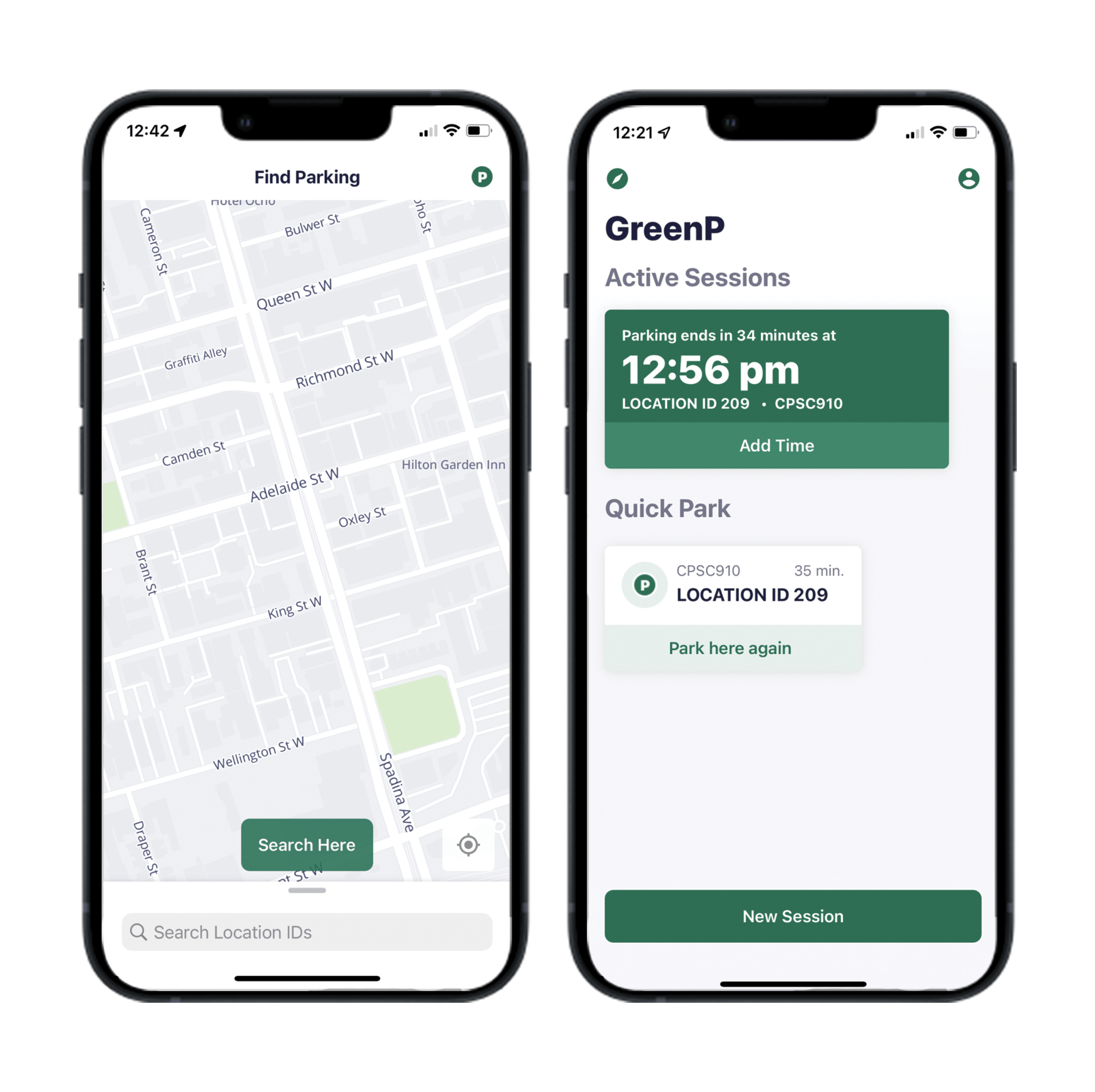
Key enhancements included the streamlined registration process, convenient payment methods like Apple Pay, improved visibility of active sessions, and additional features to help users find parking locations and access a comprehensive FAQ functionality.

Slide

The Outcome

Insight Gathering

Insight Gathering

We employ a blend of qualitative and quantitative methods to comprehensively understand app user experiences, uncovering insights on preferences, pain points, and satisfaction levels.

Key Findings Communication

Key Findings Communication

Crafting a concise executive summary highlights research methodology, participant demographics, and significant insights, providing leadership with a strategic overview for decision-making.

In-depth Analysis and Prioritized Recommendations

In-depth Analysis and Prioritized Recommendations

Our detailed analysis identifies patterns and trends, leading to prioritized recommendations. This approach ensures efficient resource allocation for addressing critical issues and optimizing user satisfaction.

Driving Continuous Improvement

Driving Continuous Improvement

We provide actionable recommendations to drive tangible improvements, fostering continuous enhancement aligned with user needs and industry trends.

Relevant Case Studies

#1 App for Contractors in North America

#1 App for Contractors in North America

Transforming a City, One community at a time

Transforming a City, One community at a time

Moving Rent Payment Technology Forward

Moving Rent Payment Technology Forward
View All

Let’s have a chat!