
With users accessing websites from desktops, mobile phones, tablets, and smart TVs, ensuring consistent usability across all screen sizes is essential. Idea Theorem Responsive Testing Services validate that your application functions seamlessly on various devices, delivering a flawless user experience.
Responsive testing ensures that websites and apps adjust smoothly to different screen sizes and orientations, providing an optimized experience across devices. It checks that design elements, navigation, content, and functionality are visually appealing and usable, regardless of the device.

Every application must have a well-structured layout and clear content to enhance usability and engagement. At Idea Theorem, we optimize layout and content by ensuring proper alignment, responsiveness, and readability across different devices and screen sizes. By testing visual consistency, typography, and spacing, we create an intuitive and visually appealing user experience.
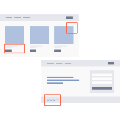
Every application must offer seamless navigation and a well-designed user interface to enhance usability and engagement. At Idea Theorem, we optimize navigation and UI by ensuring intuitive menu structures, clear call-to-actions, and consistent design across all devices. By testing user flows and interaction patterns, we create an effortless and enjoyable experience.

Every application must provide a consistent and responsive experience across different screen orientations. At Idea Theorem, we optimize for orientation changes by testing layout adjustments, content scaling, and interaction responsiveness when switching between portrait and landscape modes. By ensuring smooth transitions, we enhance usability and prevent display issues.

Every application must deliver fast, efficient, and reliable performance to ensure user satisfaction. At Idea Theorem, we optimize performance by testing load times, responsiveness, and resource efficiency across various devices and network conditions. By identifying bottlenecks and optimizing system performance, we ensure a smooth and seamless user experience.

Every application must provide a smooth and intuitive experience across both touch-based and traditional click interactions. At Idea Theorem, we optimize touch and click interactions by testing responsiveness, accuracy, and usability across various devices, from desktops to mobile touchscreens. By refining gesture controls, tap targets, and hover behaviors, we ensure seamless navigation for all users

Every application must deliver high-quality visuals without compromising performance across different devices and screen sizes. At Idea Theorem, we optimize image and media scalability by testing resolution, loading times, and adaptive resizing to ensure seamless display across various platforms. By implementing responsive design techniques, we enhance visual clarity while maintaining fast performance.
Define devices, screen sizes, and resolutions to test, based on user data from tools like Google Analytics.
Create scenarios covering key features like navigation, forms, and interactions, ensuring touch gestures and orientation changes are included.
Leverage responsive modes in browsers like Chrome and Firefox to simulate various devices and screen sizes for quick assessments.
Test on actual devices to identify real-world issues like touch gestures and screen quality that emulators might miss.
Document issues like broken layouts or misaligned content, and address them to ensure consistency across all devices.

We ensure that your application works flawlessly across desktops, mobile phones, tablets, and smart TVs, enhancing user satisfaction and engagement.
Our testing covers all key devices, screen sizes, and browsers, ensuring compatibility and functionality, whether users access your application on a phone or desktop.
Responsive design improves page load speed, accessibility, and mobile-friendliness, directly impacting SEO rankings and mobile conversions.
By testing across devices, we ensure consistent branding, leading to better customer trust and recognition across all platforms.