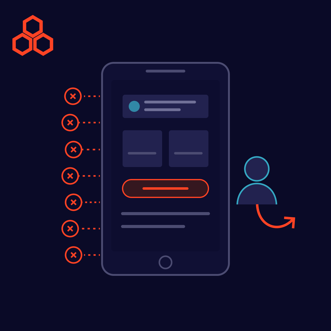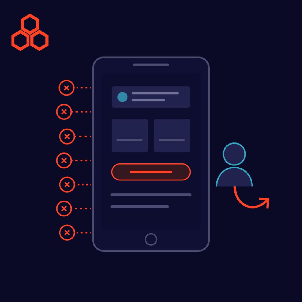
Most users never tell you why they left. They simply close the tab, uninstall the app, or abandon the cart, and your analytics record a lost visit instead of a lost customer. Behind those silent exits are almost always the same handful of user experience problems: friction that makes a product slower, harder, or less trustworthy than the alternative one tap away. The good news is that these problems are common, predictable, and fixable.
Product team reviewing user experience problems on a session replay and analytics dashboard
Speed is part of the experience. Users don’t separate “the design is bad” from “the page took too long,” so every extra second of waiting adds frustration before they’ve seen your value. Performance problems also tend to grow quietly as teams ship features, which is why they often trace back to accumulating technical debt.
Fix it: set a performance budget, compress images, defer non-critical scripts, and monitor real-user load times continuously.
If users can’t tell where they are or how to reach what they want, they won’t hunt for it. Overloaded menus, vague labels, and inconsistent structure all push visitors toward the exit.
Fix it: keep primary navigation short, use plain-language labels, and test your menu structure with real users before launch.
When a screen offers ten equally weighted choices, users choose none. Weak visual hierarchy makes it hard to see the one thing you want them to do next.
Fix it: give each screen one primary action, use whitespace deliberately, and make buttons describe the outcome (“Start free trial” beats “Submit”).
Many users meet your product on a phone first. Tiny tap targets, layouts that break on small screens, and desktop-only features turn a simple task into a chore.
Fix it: design mobile-first, test on real devices, and make sure core tasks work equally well on every screen size. A flexible content setup, like the headless CMS approach we compared earlier, can make delivering consistent experiences across devices easier.
Checkout is where user experience problems cost the most. A 2024 ranking reported by RetailBoss, which credits Statista, lists the top reasons shoppers abandon carts: extra costs such as shipping and fees (48%), mandatory account creation (26%), and a long or complicated checkout (22%). The source doesn’t publish its sample size, so treat the percentages as directional. The pattern is still clear: surprises and friction at the final step cost sales.
Fix it: show total costs early, offer guest checkout, remove every non-essential field, and use clear inline error messages.
New users decide quickly whether a product is worth learning. If they can’t reach a first moment of value, such as a completed task or a visible result, they rarely come back. This matters just as much inside companies: our post on enterprise software user adoption shows why even powerful tools fail when onboarding is an afterthought.
Fix it: shorten the path to first value, replace long tutorials with in-context guidance, and track where new users drop off.
Low color contrast, missing labels, and interfaces that can’t be used with a keyboard or screen reader shut out a meaningful share of potential customers. They also hurt everyone in difficult conditions, such as bright sunlight or a noisy room.
Fix it: follow established accessibility guidelines such as WCAG, and include assistive-technology testing in every release.
You don’t need to guess which of the seven is hurting you:
Tools such as personalization and recommendations can also lift engagement once the basics work, as explored in our guide to AI business use cases. Smart features can’t rescue a product that is slow, confusing, or hard to check out from.
Fixing user experience problems is one of the most reliable ways to improve engagement and conversions without buying more traffic. Start with the friction closest to revenue, usually performance and checkout, then work outward. Every obstacle you remove is one fewer reason for a user to leave.
Suggested Reads
Trending Resources